4口 | Four Bites
–
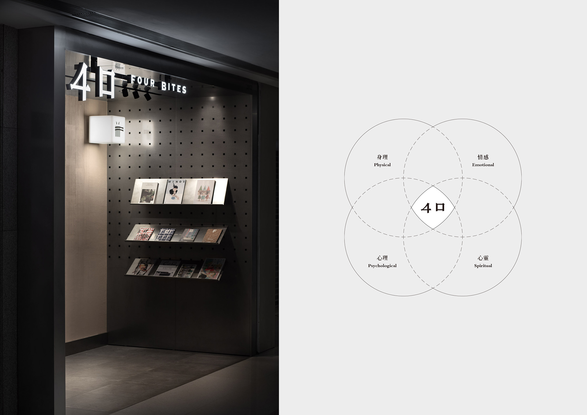
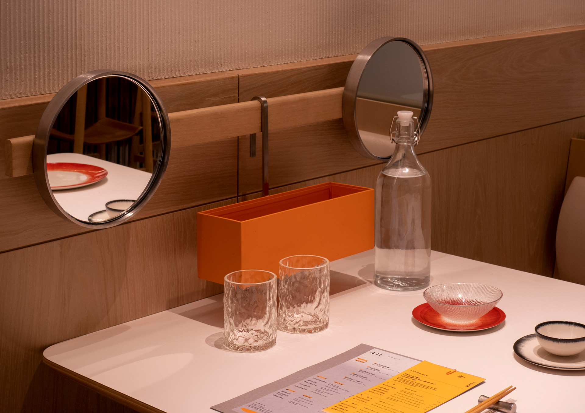
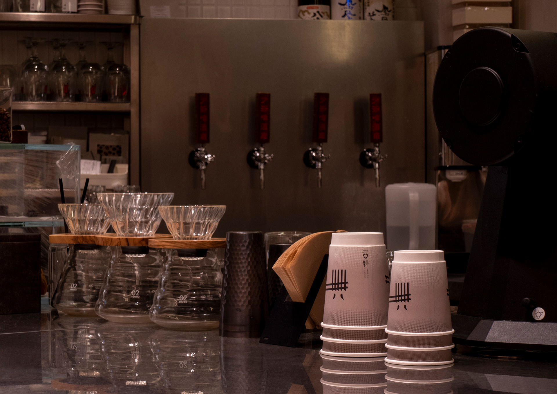
「4口」是一所位於香港中環的福建菜概念餐廳,以飲食結合生活和藝術文化。「4口」取名自四個層面的飽足:身理、情感、心理、心靈,以食物、設計、音樂、藝術空間及氛圍之間的巧妙配搭,帶大家從五感去滿足四個需要。
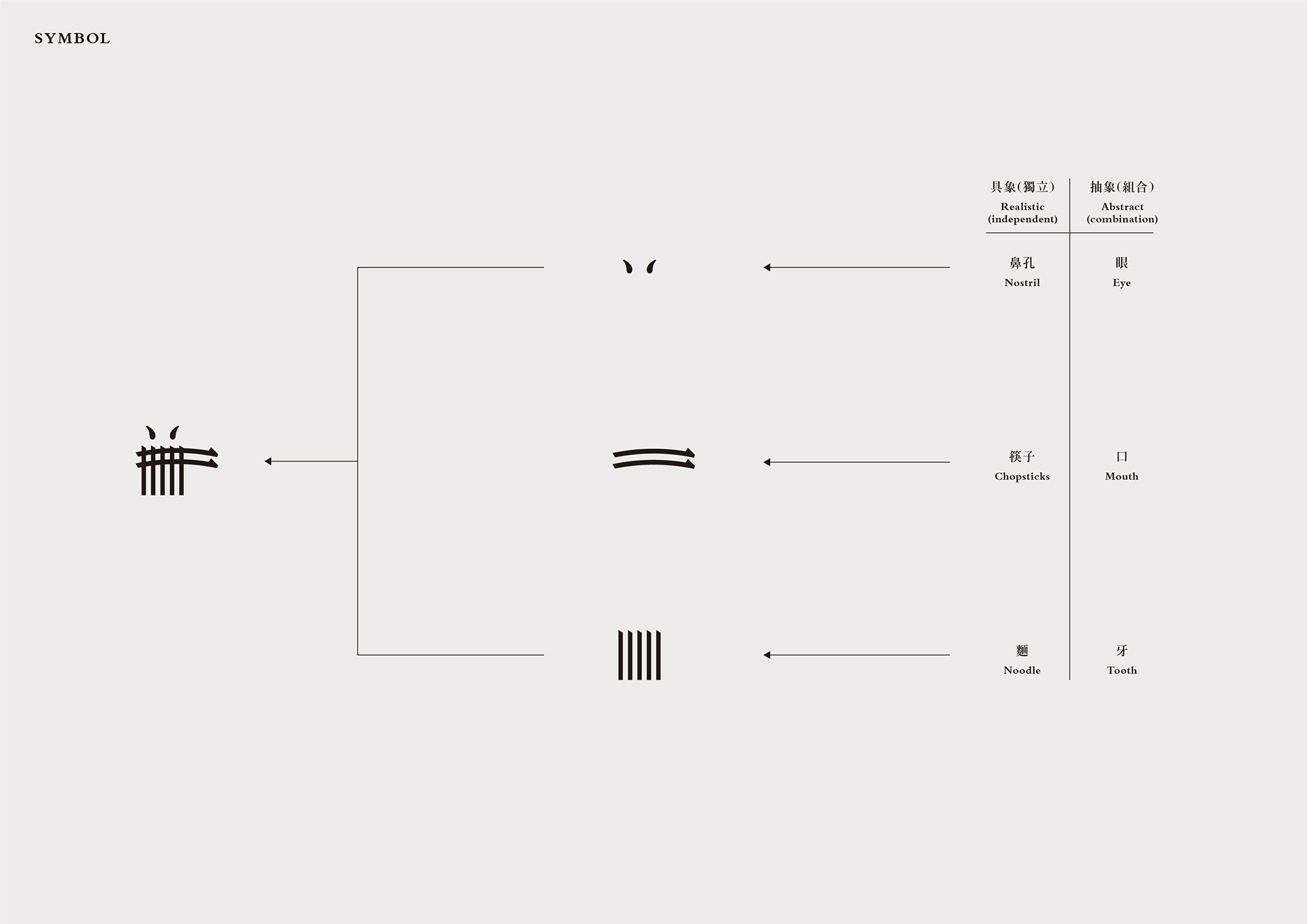
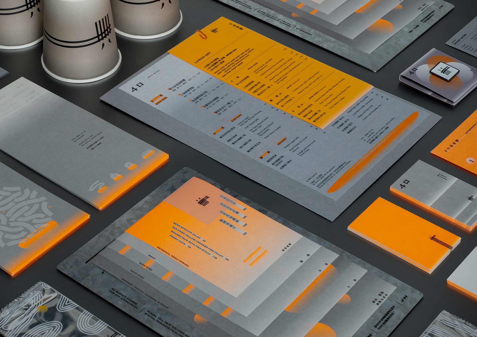
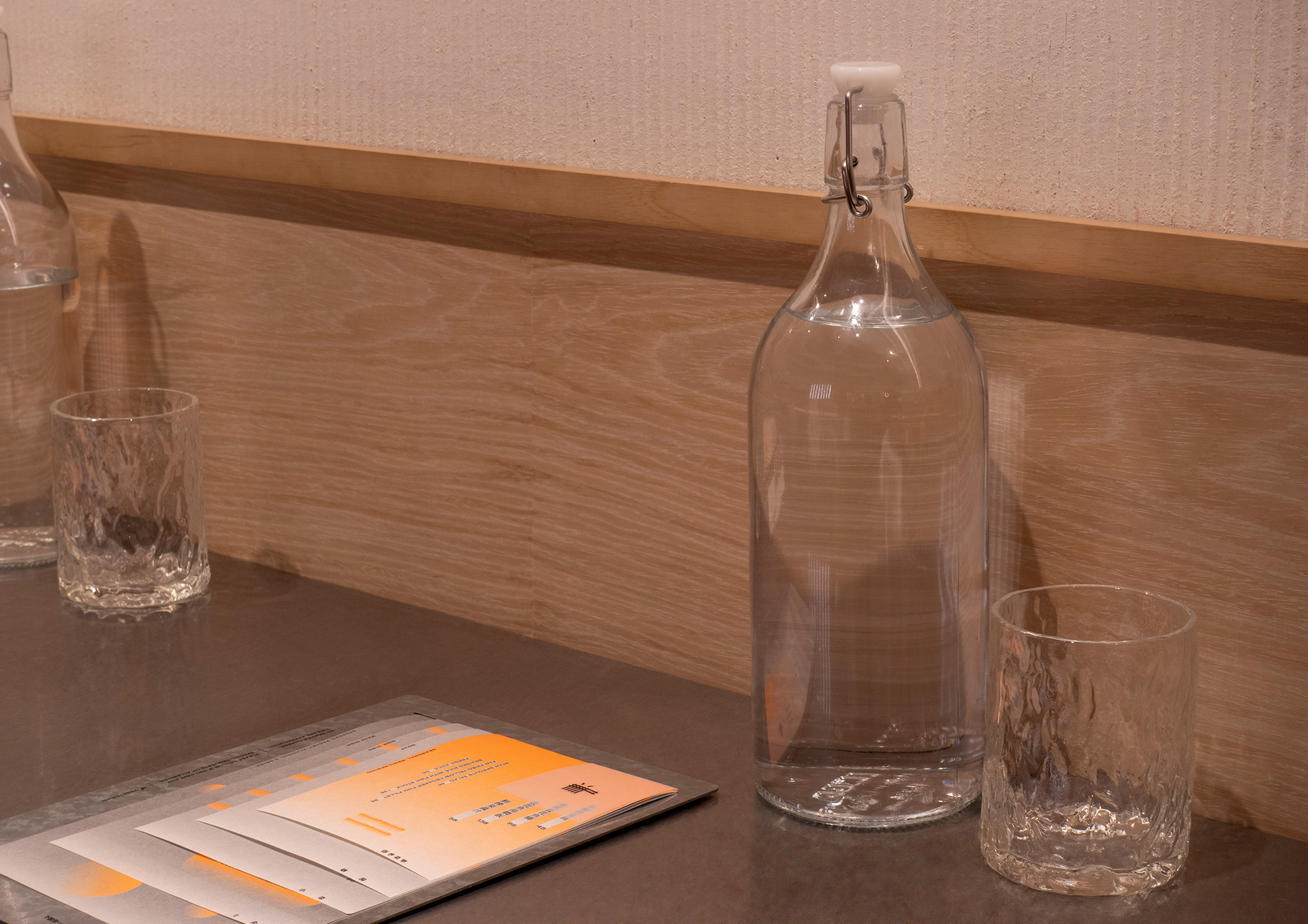
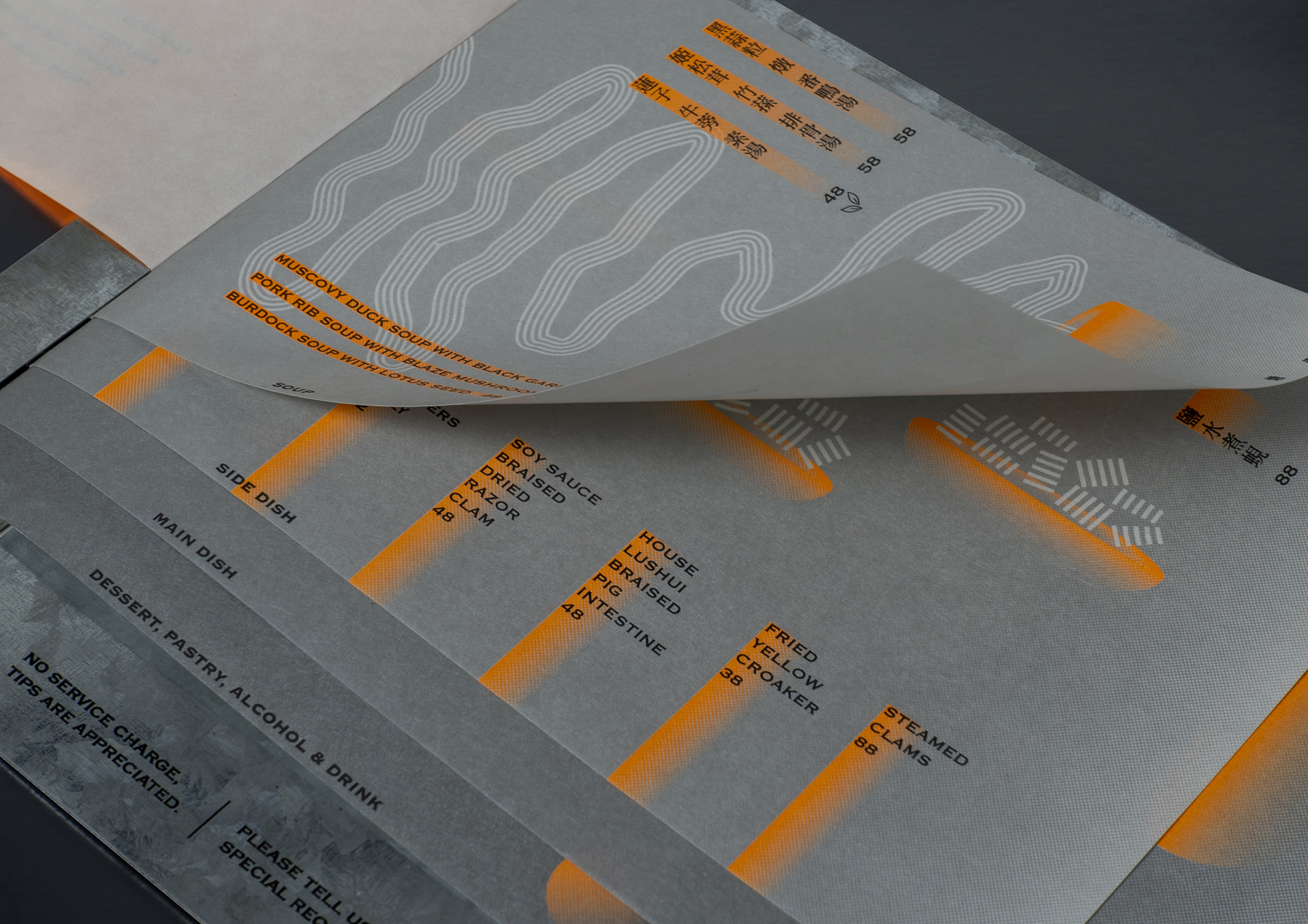
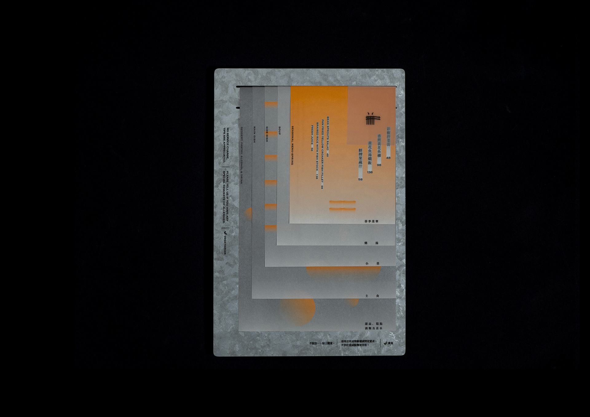
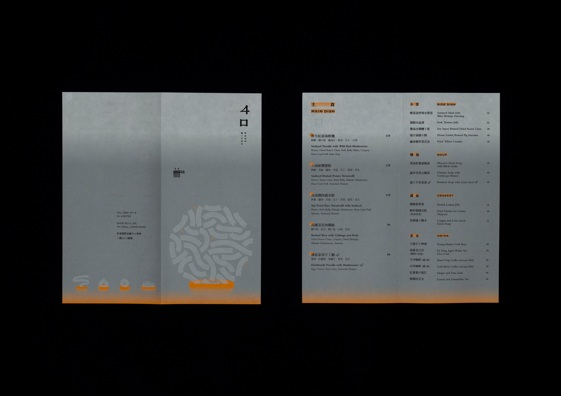
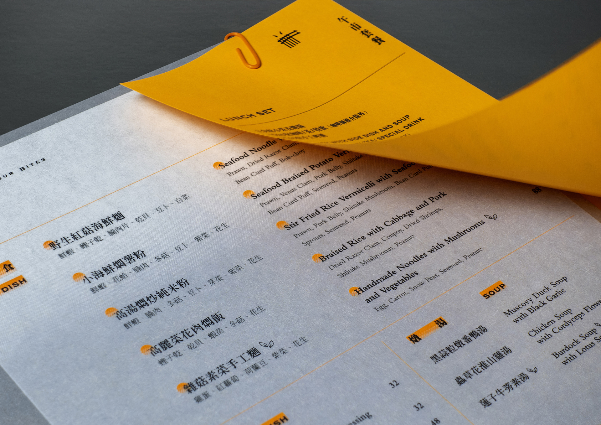
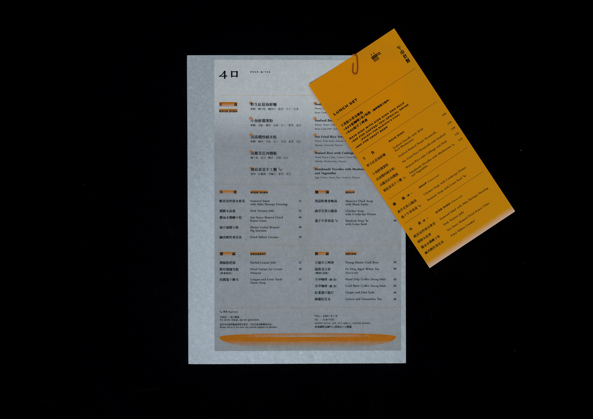
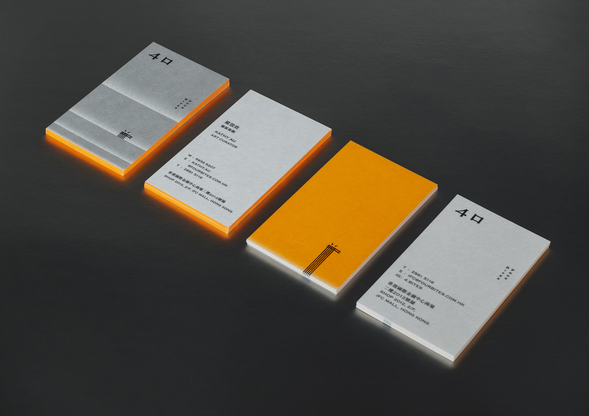
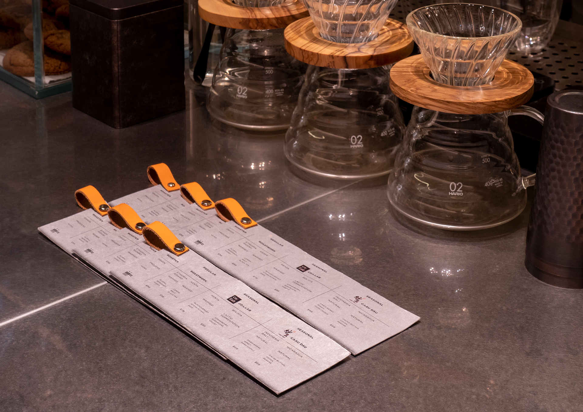
品牌以鮮明的螢光橙色作主調,為品牌帶來新鮮、年輕的感覺。標誌名稱中採用中文筆畫的特徵設計羅馬數字「4」,稍稍帶出中菜的本質,同時提升品牌的現代感。標誌利用中文筆畫設計成吃麵的樣子,筆畫的彎曲帶出吃麵時的動態,時而像眼睛、時而像鼻孔的兩點,為標誌帶來有趣的視覺效果。餐牌以雙語設計,同時考慮閱讀方向,用家能因應自己的語言選擇垂直或横向閱讀餐牌。
"Four Bites" is a Fujian cuisine concept restaurant located in Central, Hong Kong. It combines life and art culture with food. "Four Bites" is named after four levels of satiety: physical, emotional, psychological, and spiritual. With the ingenious combination of food, design, music, artistic space and atmosphere, it takes everyone from five senses to meet the needs of "four".
Neon orange is the brand color, which brings a fresh and youthful sense to the brand. The logotype apply characteristics of Chinese strokes to the Roman numeral "4", which slightly brings out the essence of Chinese cuisine and enhances the modern sense of the brand. The logo is designed to look like eating noodles with chopsticks (Chinese strokes). The bending of the strokes brings out the dynamics of eating, sometimes like eyes and sometimes like nostrils, bringing interesting visual effects to the logo. The bilingual menu takes the reading direction into consideration. Users can choose to read the menu vertically or horizontally according to their own language.