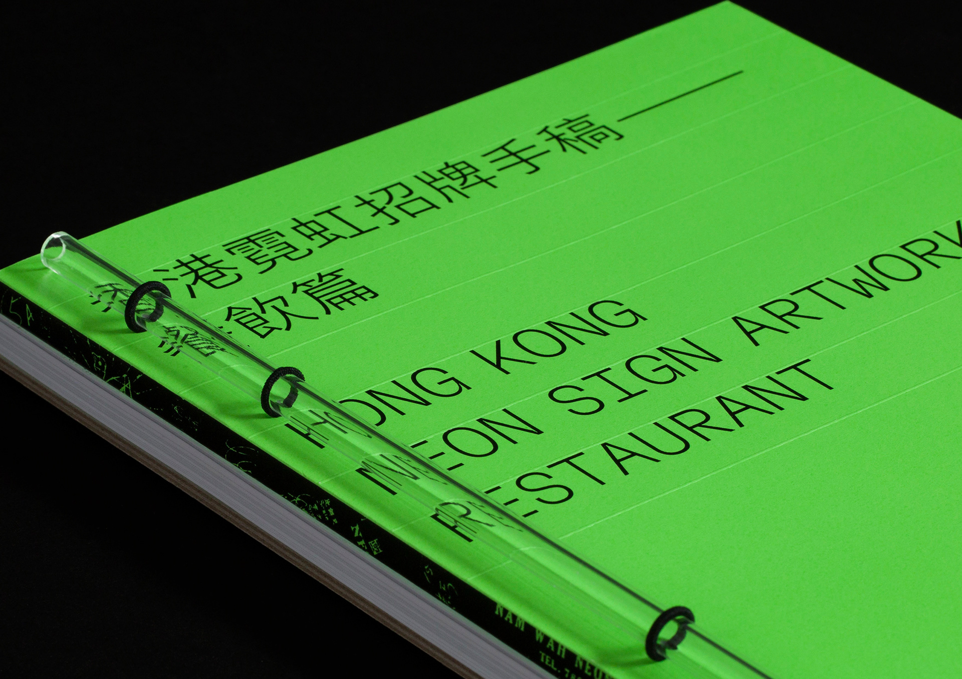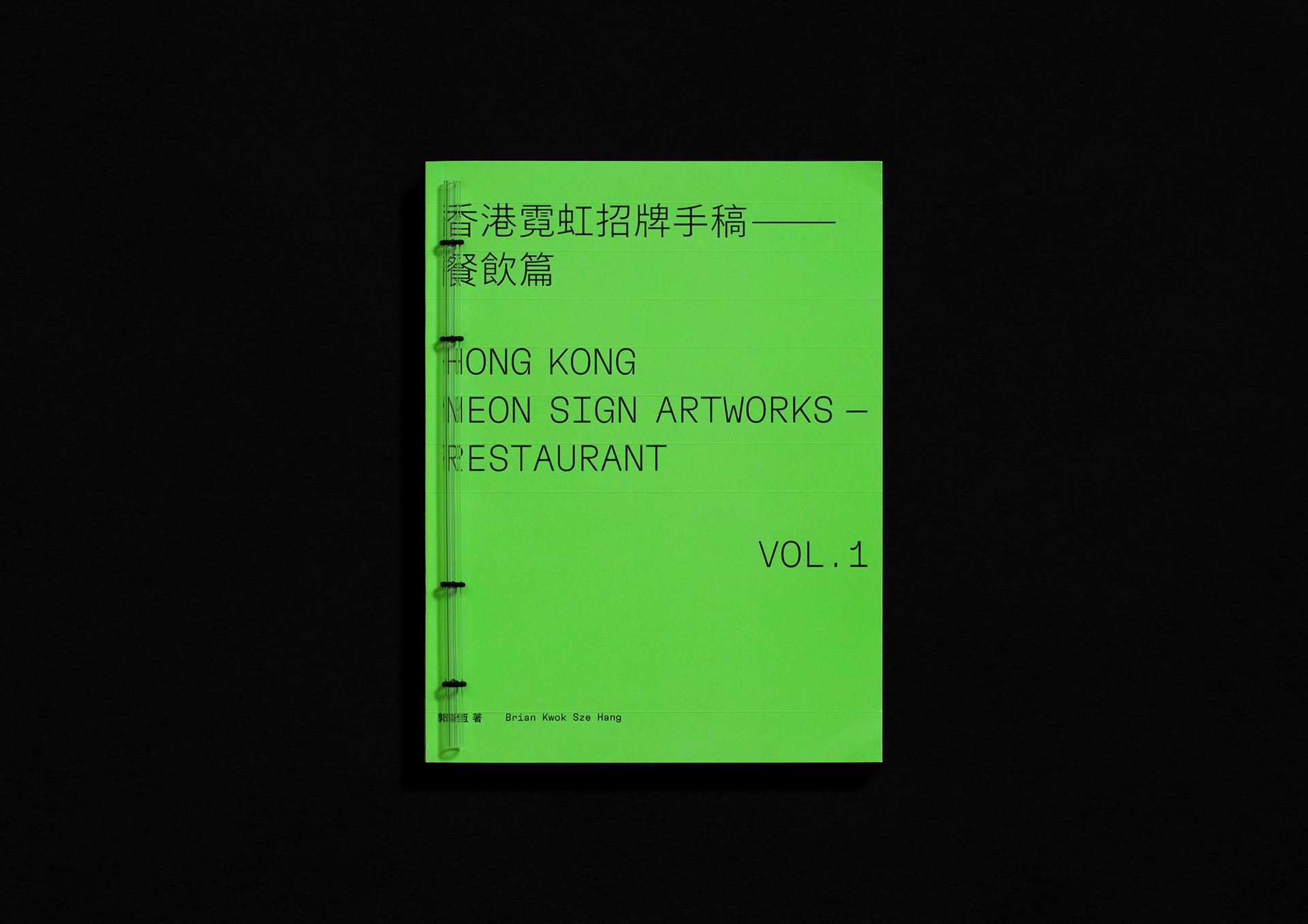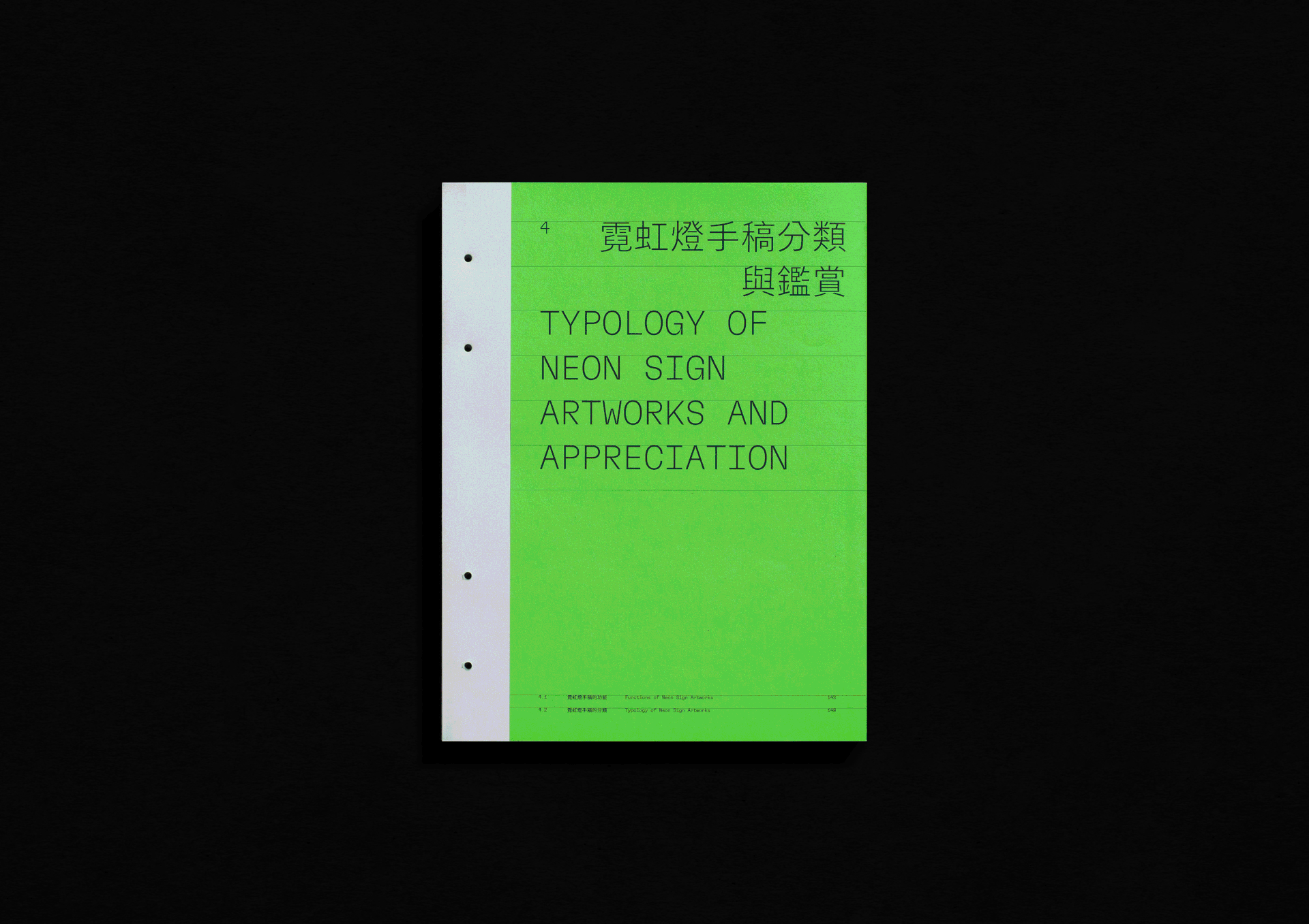
《香港霓虹招牌手稿——餐飲篇》
Hong Kong Neon Sign Artworks — Vol. 1 Restaurant
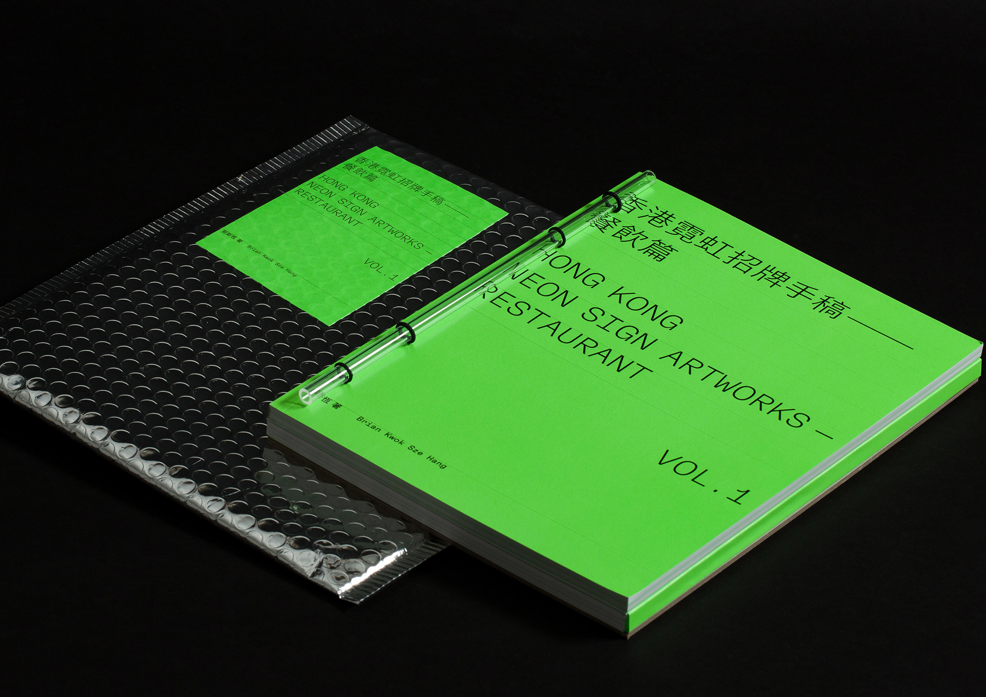
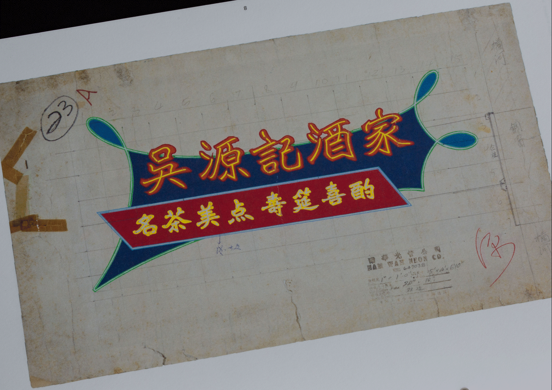
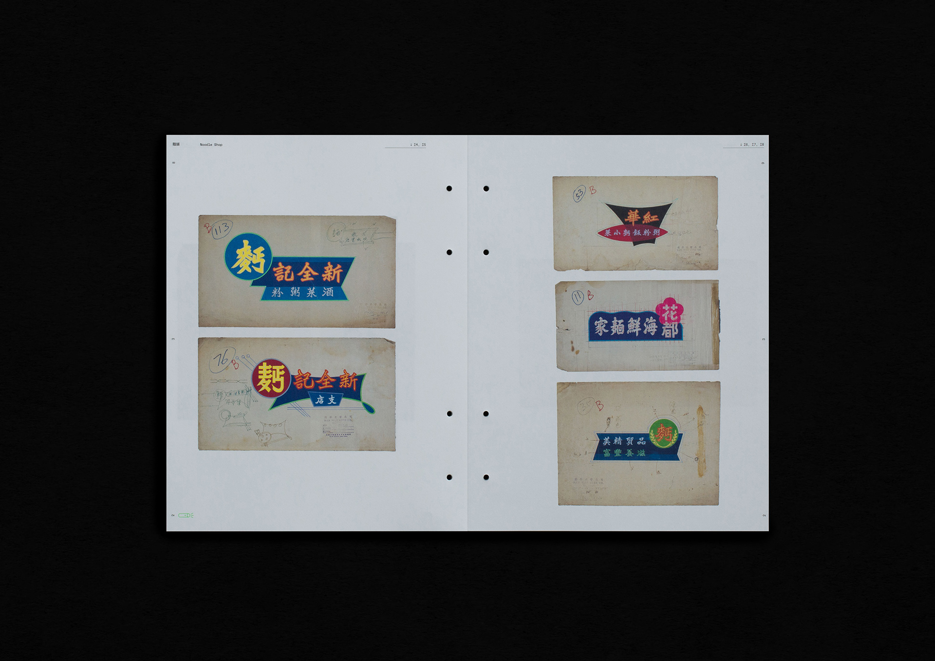
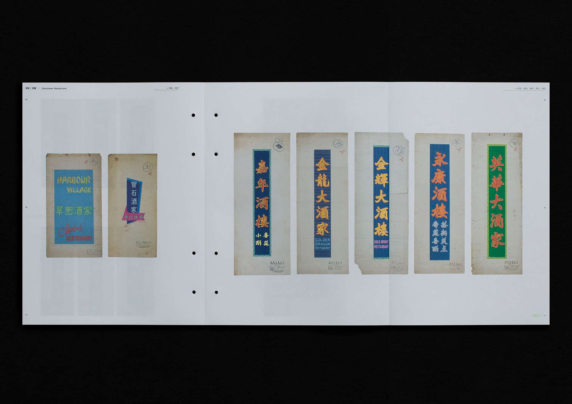
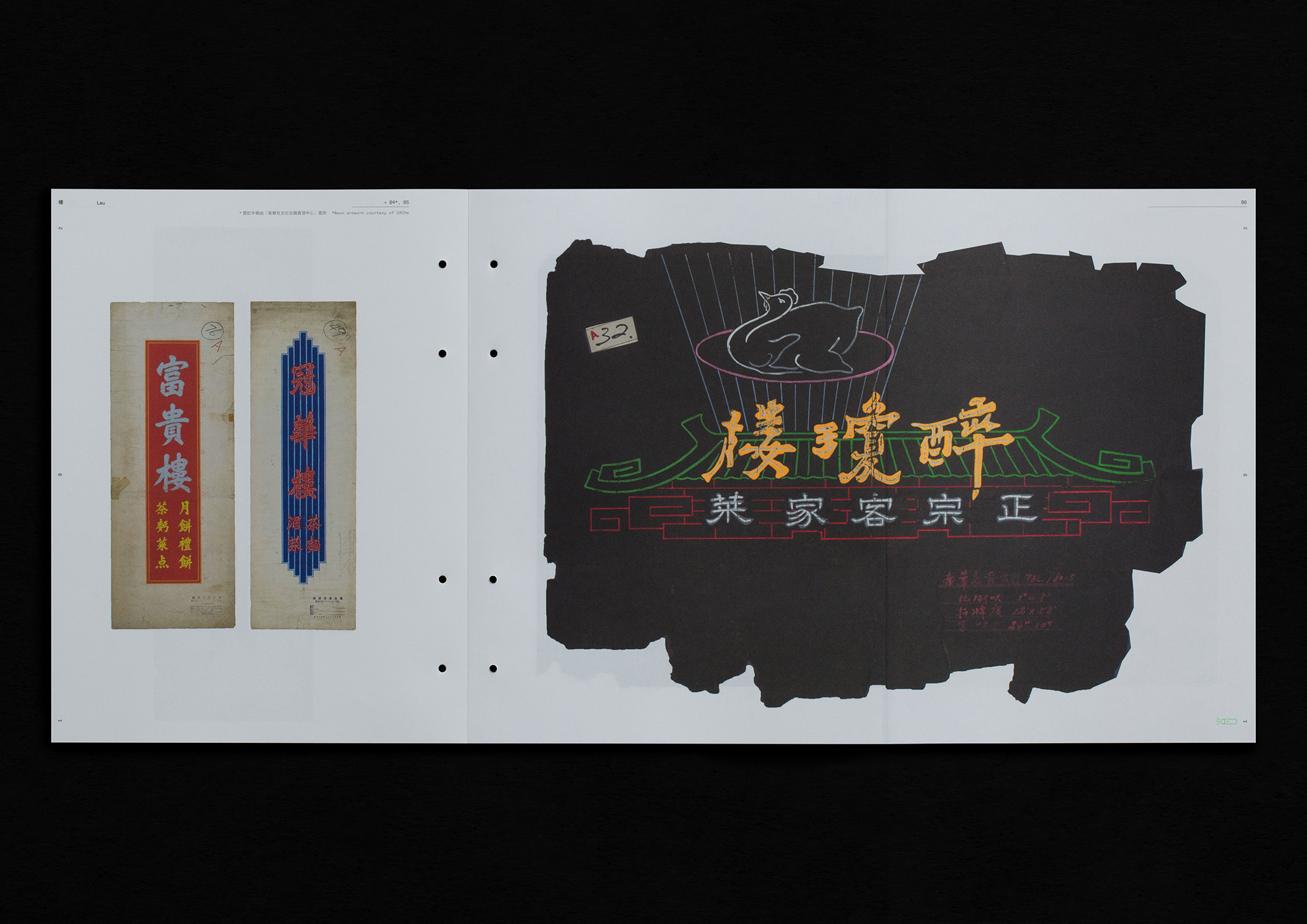
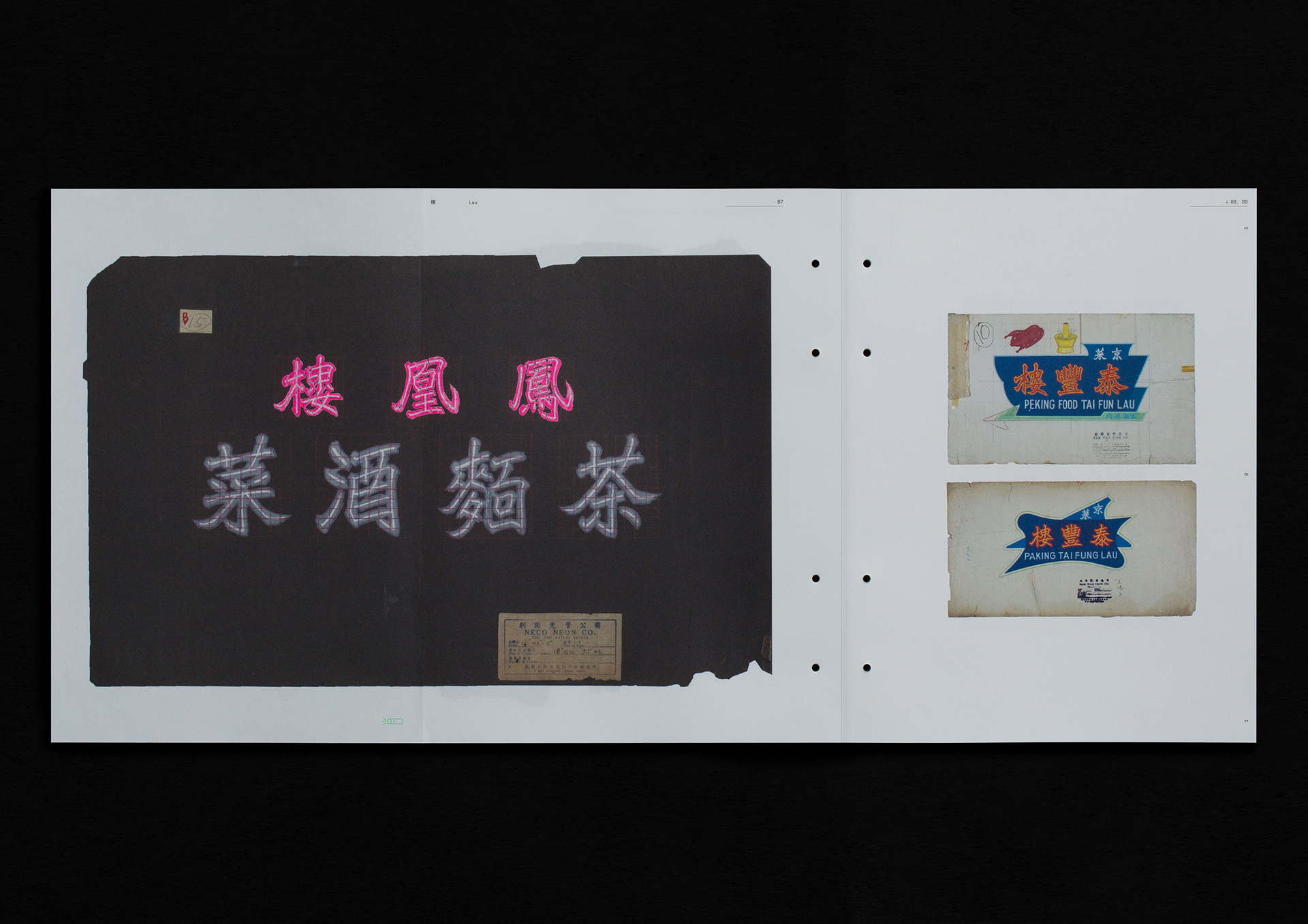
《香港霓虹招牌手稿——餐飲篇》是作者郭斯恆第二本關於香港霓虹招牌的著作,我們希望於書籍設計上帶給讀者新鮮感,無論是用色、釘裝物料及印刷上,帶出與霓虹招牌相關的視覺體驗。此書分為兩冊,第一冊由三個章節組成,講述香港霓虹燈歷史與香港餐飲歷史;第二冊則包含第四章,記錄218張餐飲業霓虹招牌手稿。
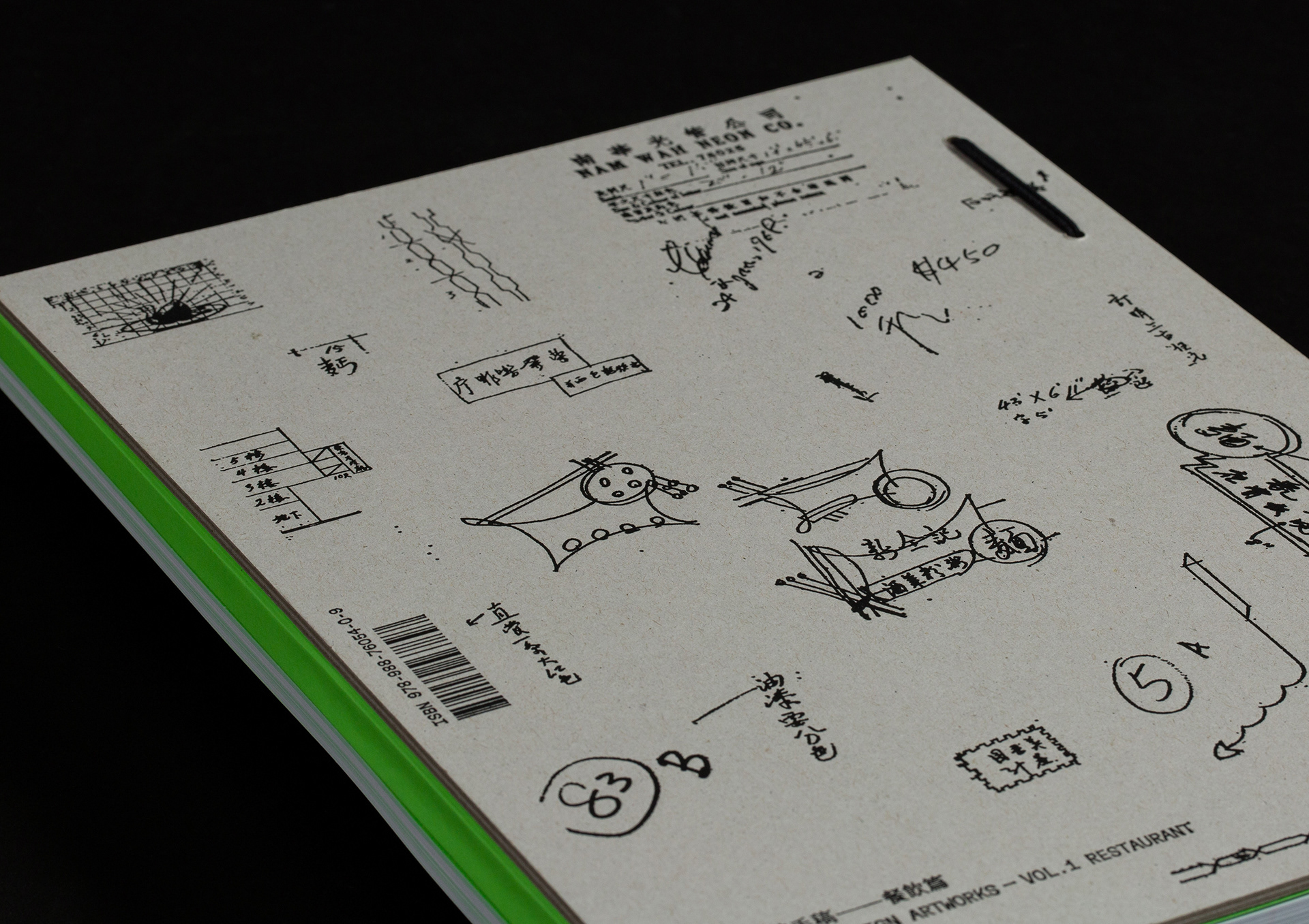
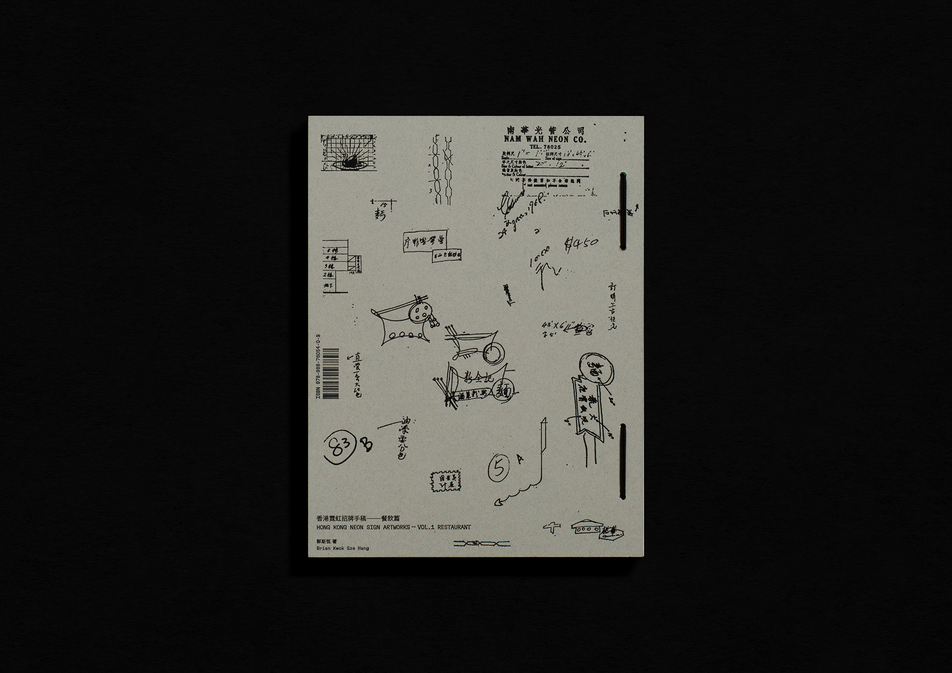
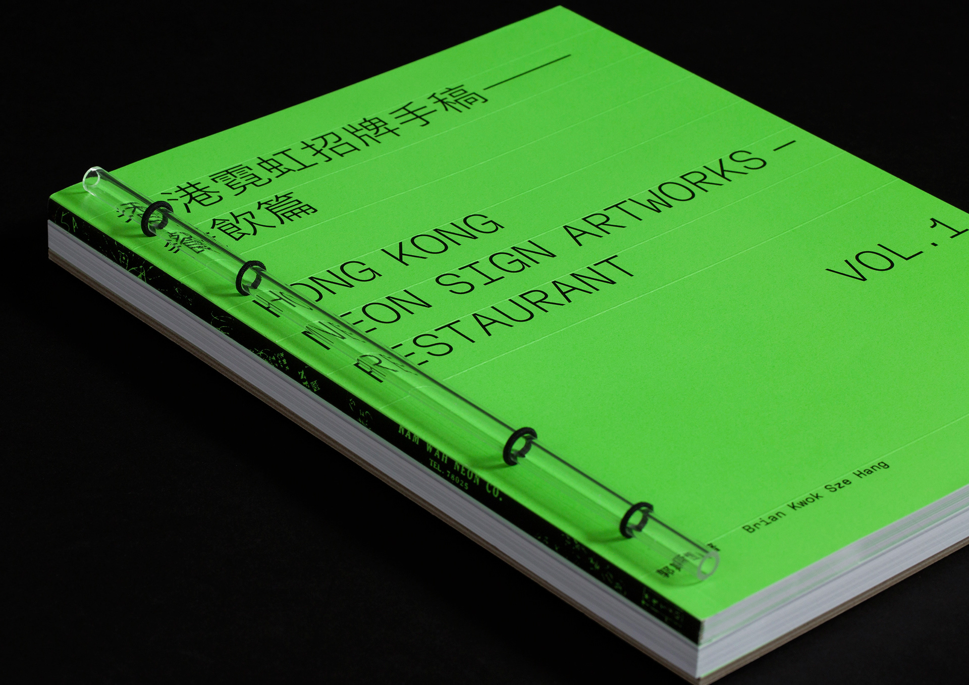
書籍設計參考檔案庫常見的資料文件夾,封面為配合書題採用壓線效果,而書底以燙黑方式呈現霓虹師傅的鉛筆草圖。釘裝方面,我們用上透明亞加力膠管模仿霓虹光管,並以橡筋固定兩冊,讓讀者可隨意分拆並排閱讀。
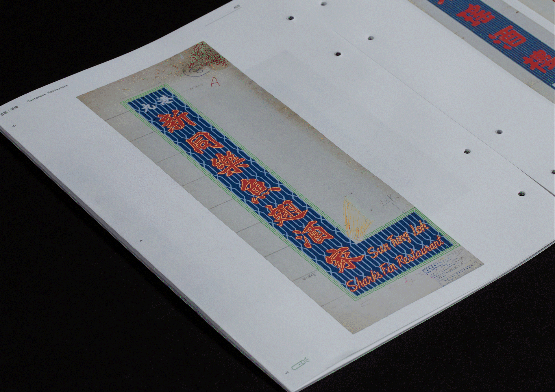
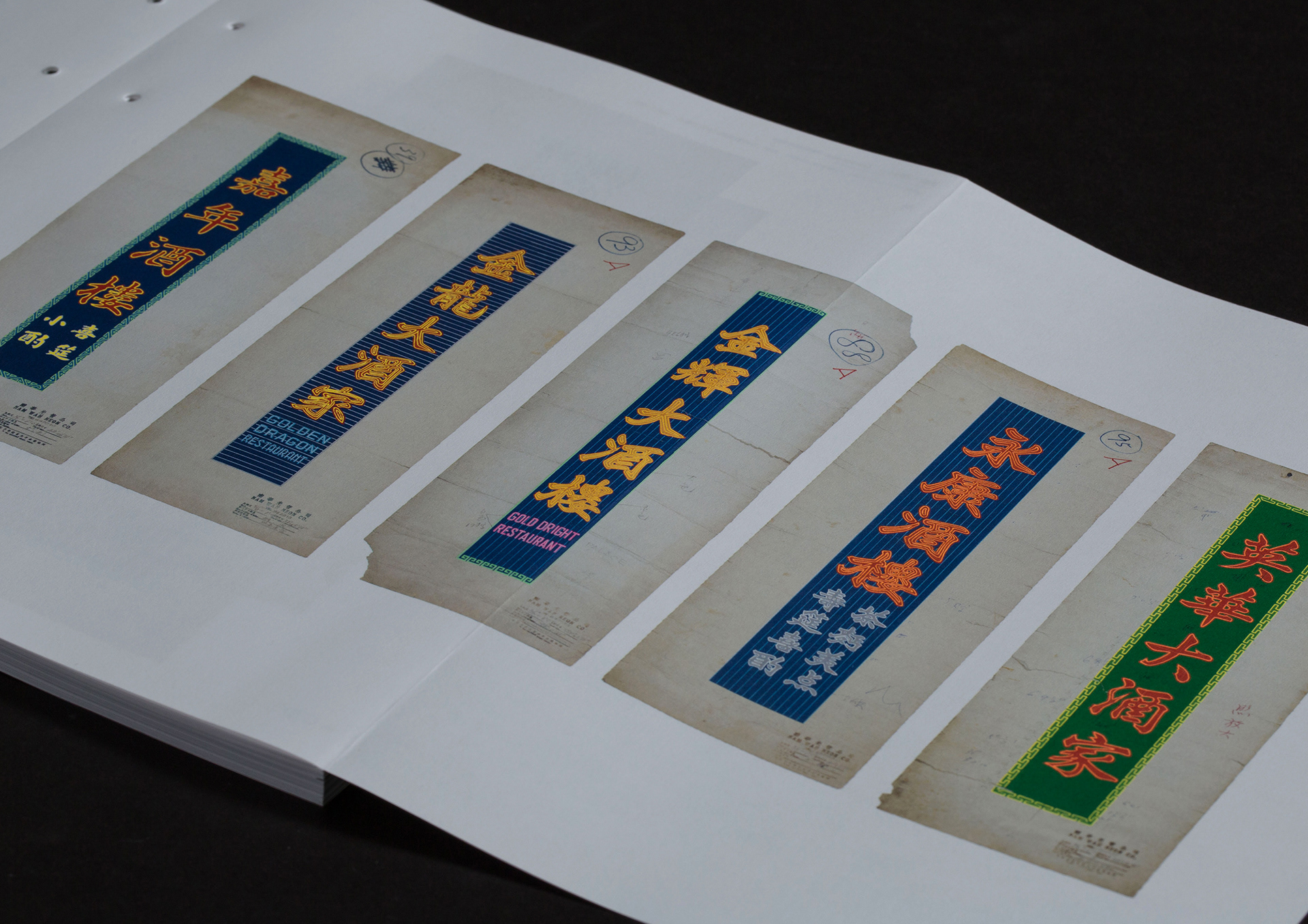
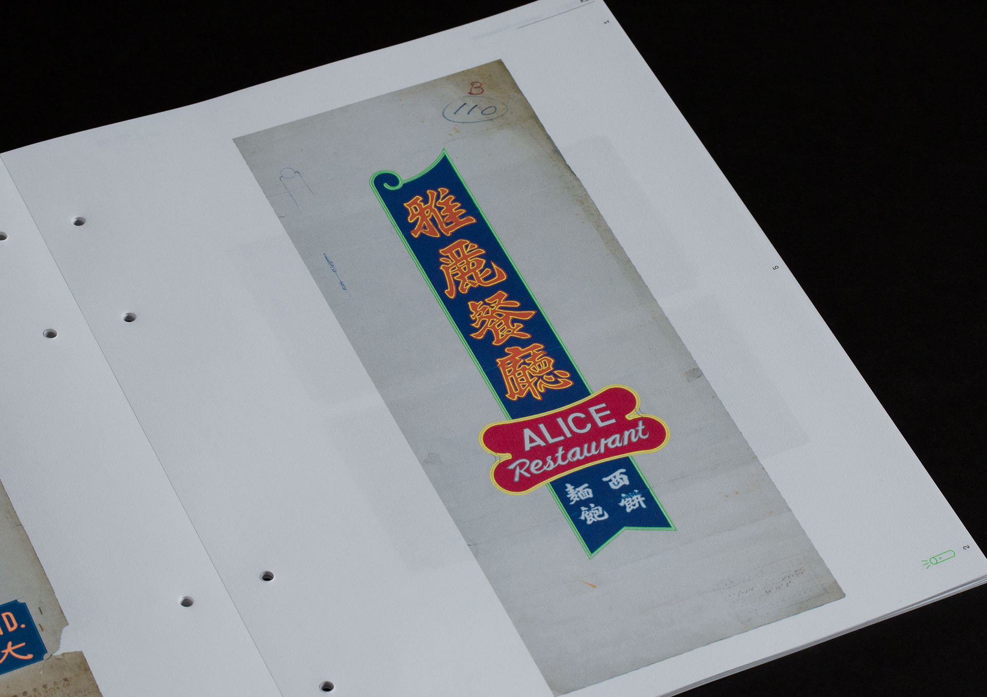
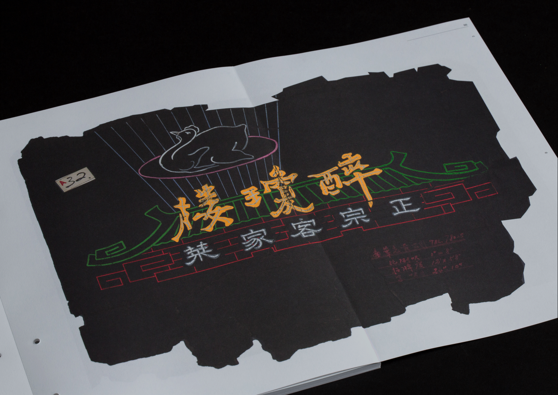
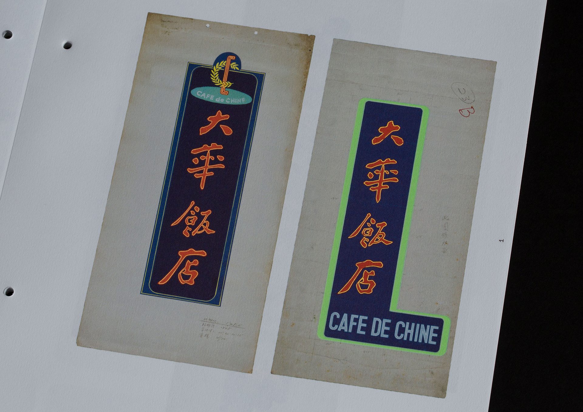
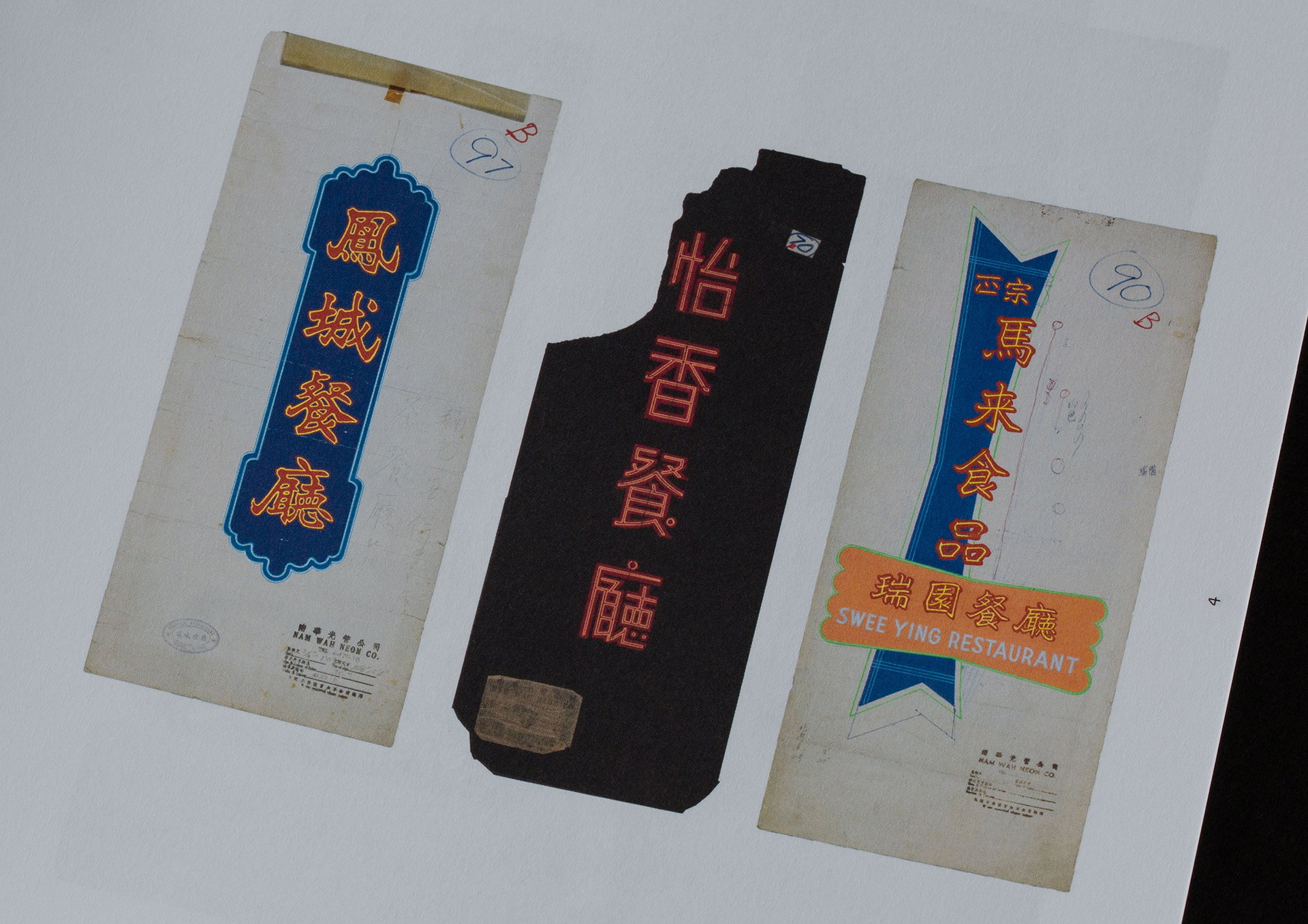
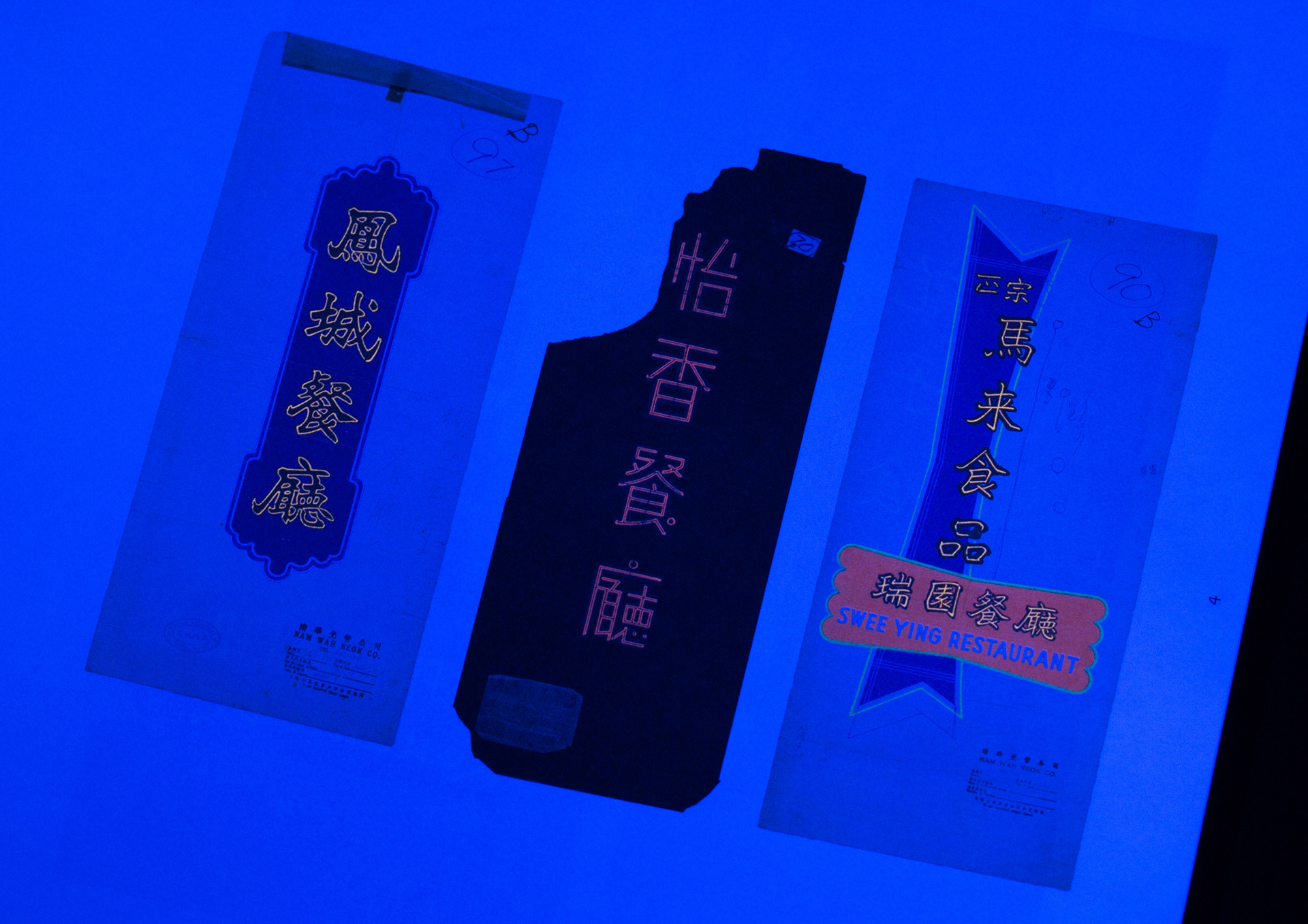
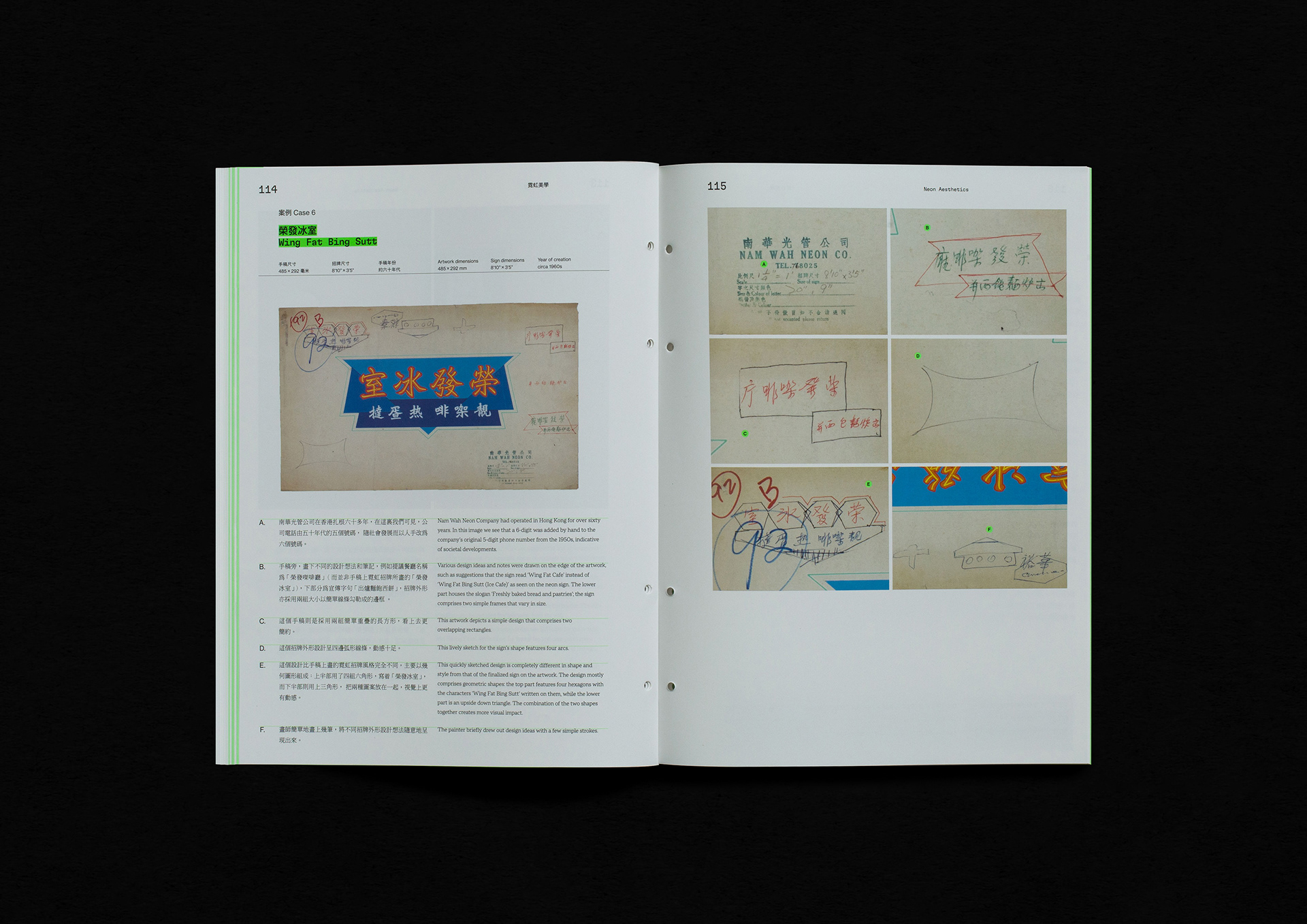
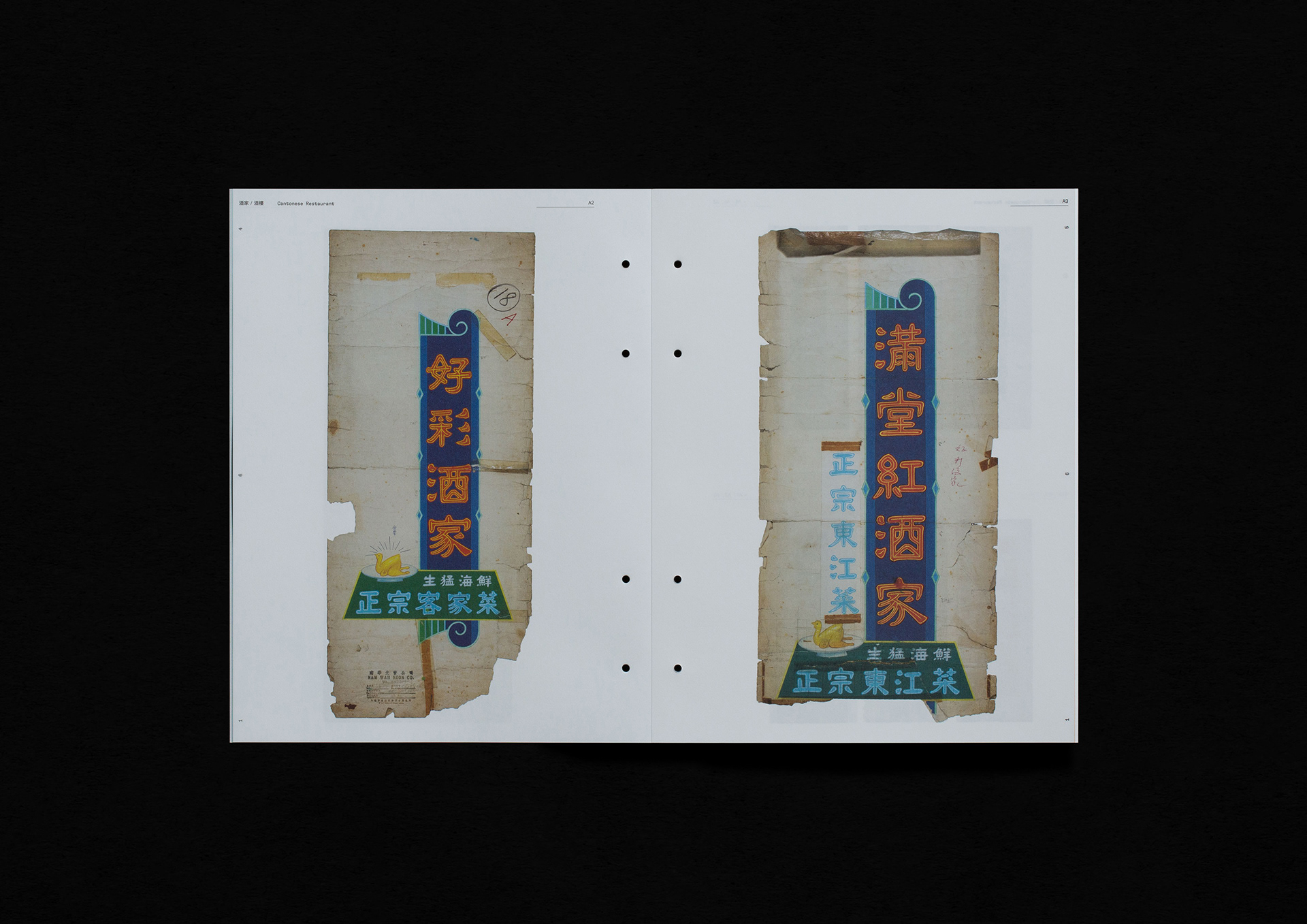
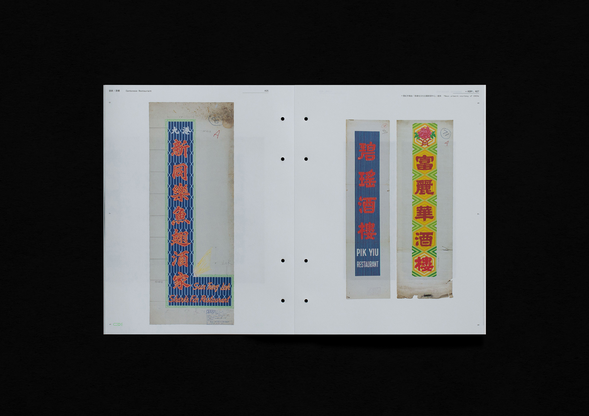
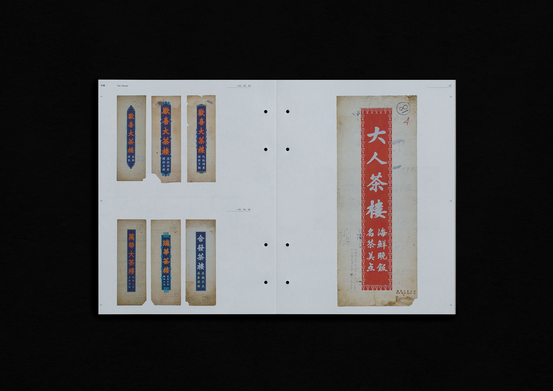
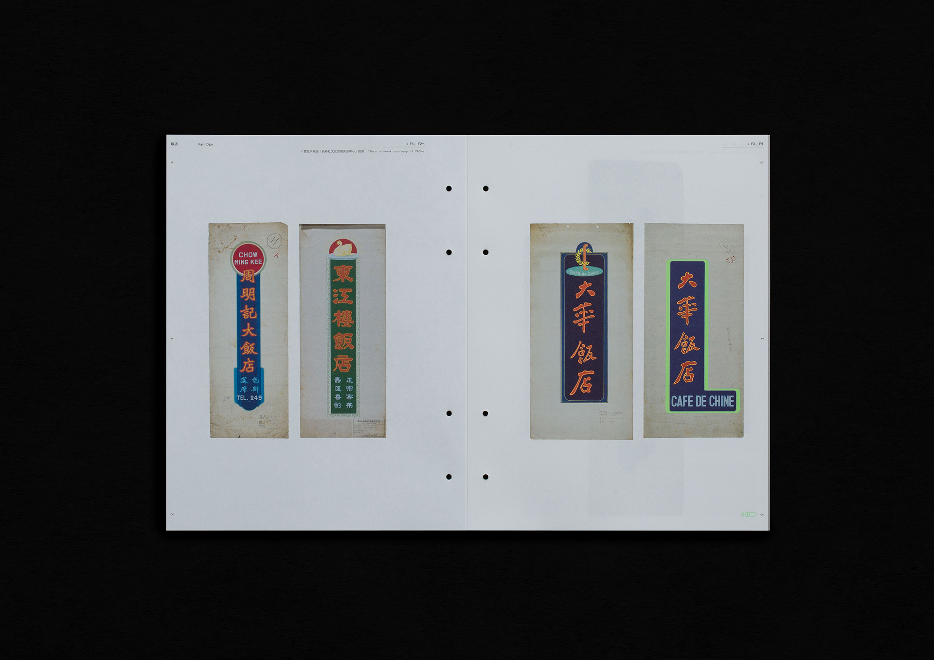
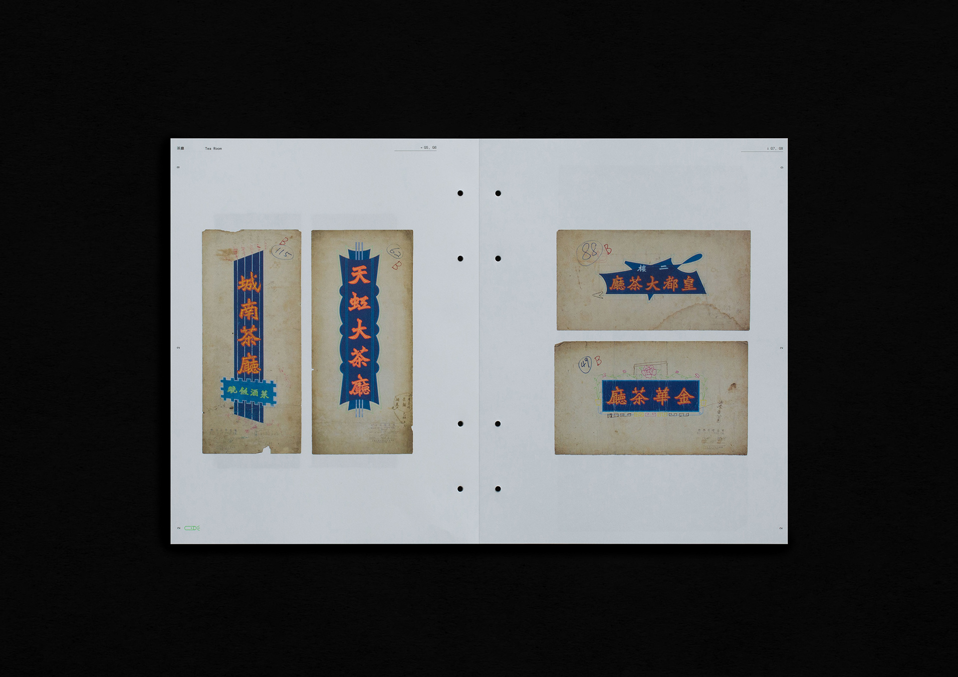
兩冊分別採用觸感對比強烈的光粉紙及書紙,部分手稿更用上八色印刷(加入了螢光粉紅、螢光綠、螢光黃及螢光橙色),活現出招牌手稿的視覺效果。
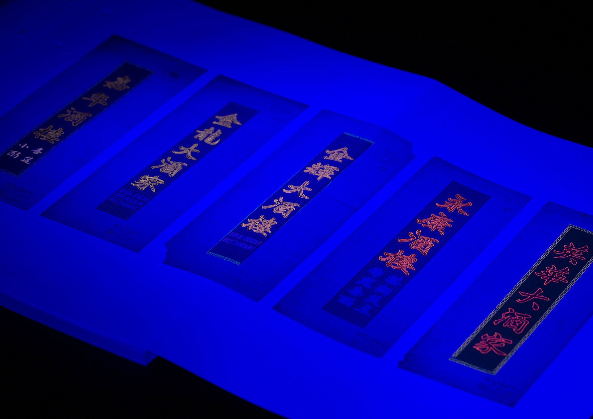
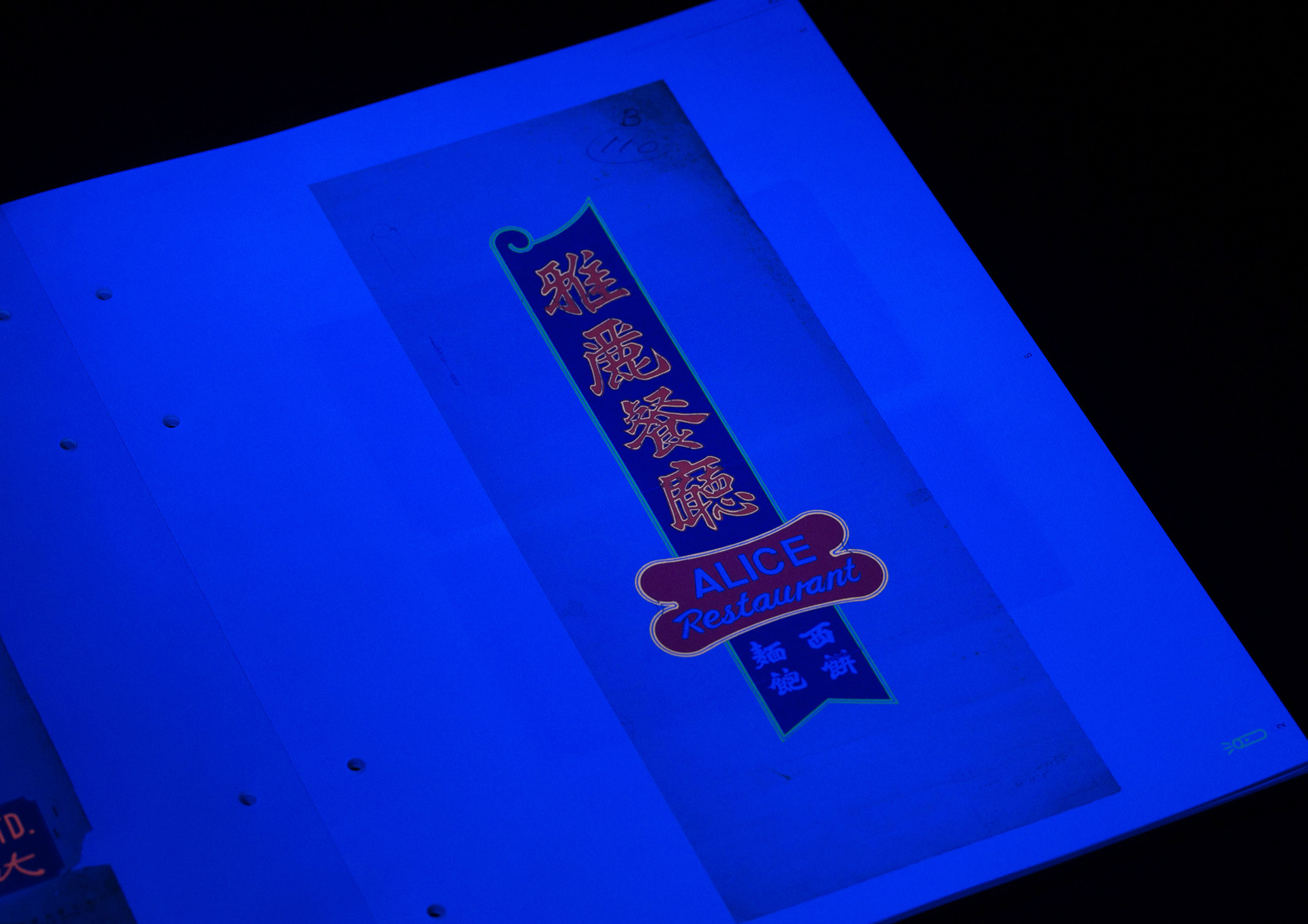
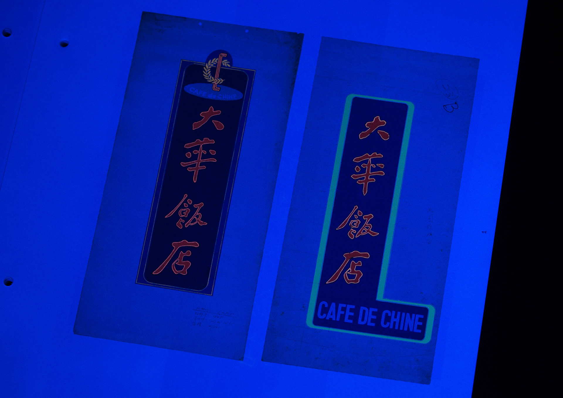
另外,本書附送紫外光小電筒,只要讀者利用它於昏暗的環境照射印上螢光油墨的手稿,便能模擬霓虹光管於晚上發光的效果。由於手稿線條加入了螢光油墨,若墨量拿捏得不準確,便會造成與原稿的色差。因此在正式印刷前,我們與印廠經過多番測試,確定每張手稿、每條線條的最佳油墨比例、以及在書紙上的印刷效果。
這個印刷工序旨在帶領讀者從不同角度(日與夜)欣賞這些源自五十至七十年代的霓虹招牌手稿,將香港霓虹招牌的美好好記錄下來。
Hong Kong Neon Sign Artworks — Vol. 1 Restaurant is Brian Kwok’s second publication on Hong Kong neon signs. We hoped to create a refreshing book design centring on the neon sign visual experience, consistent across the choices of colour, binding, material and printing techniques. This book consists of two booklets, the first one made up of three chapters on the histories of neon sign and dining in Hong Kong, and the second containing a fourth chapter documenting 218 neon sign sketches of the restaurant industry.
The inspiration of the book design came from document folders commonly seen in archives. To match the theme of the publication, embossed texts express the materiality of neon signs on the front cover, whereas the hot stamping effect on the back cover refers to the pencil sketches by neon sign makers. As for the binding, a clear acrylic tube mimicking a fluorescent tube is fastened by rubber bands, holding together the entire publication. The two booklets can be disassembled and read side by side.
The two booklets were printed on coated and uncoated papers respectively to distinguish them with contrasting tactilities. Some of the neon sign sketches went through eight-colour process printing — including neon pink, green, yellow and orange — to fully present the visual effects of the originals. With the addition of neon inks, any inaccuracy in the ink mix would have resulted in a mismatch with the original materials’ colour tones. Hence, we went through rounds of testing to ensure the ink mixture proportions and printing effects of each line in every sketch were correct.
The publication comes with a small ultraviolet torch. When readers use it to cast light on sketches printed with neon ink in a dark environment, there will be a luminescent effect akin to fluorescent tubes emitting light at night. All these efforts placed in the printing process aim to provide different ways of appreciating these 1950s–1970s sketches, which have preserved fond memories of Hong Kong neon signs.
Client: Information Design Lab, School of Design, The Hong Kong Polytechnic University
Author: Brian Kwok Sze Hang
Book Design: Nous
Illustration: Carol Ng
Project Coordinator: Kiki Yau
Printing Production: Suncolor Printing