棉麻
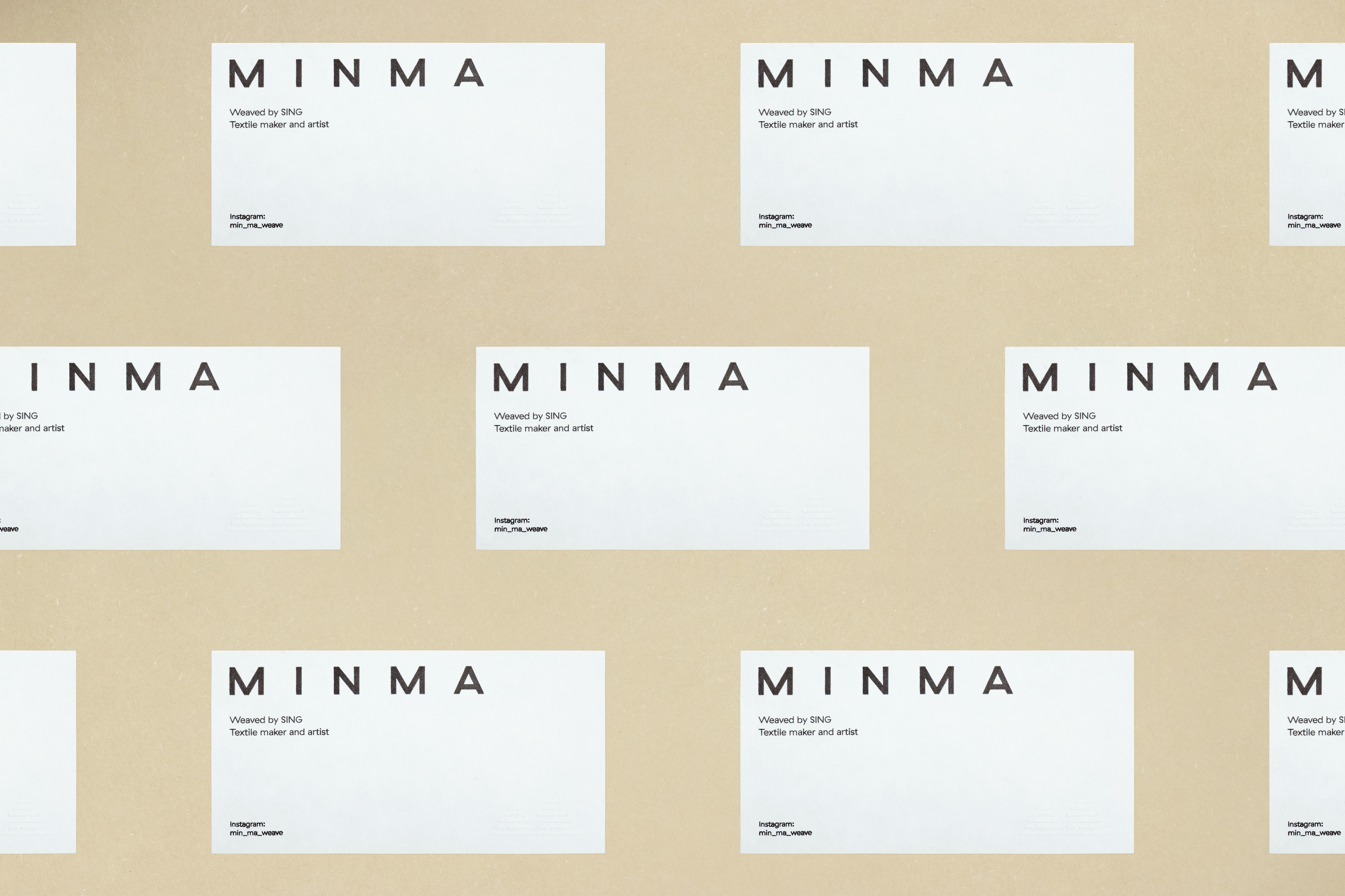
MINMA
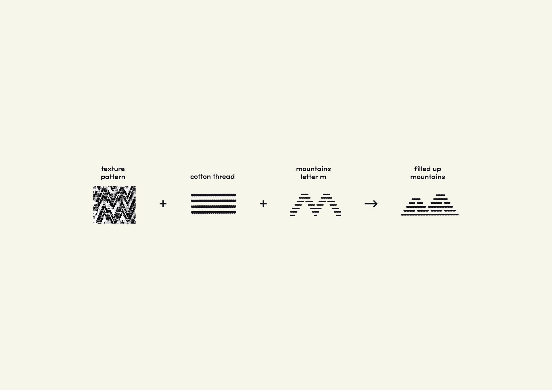
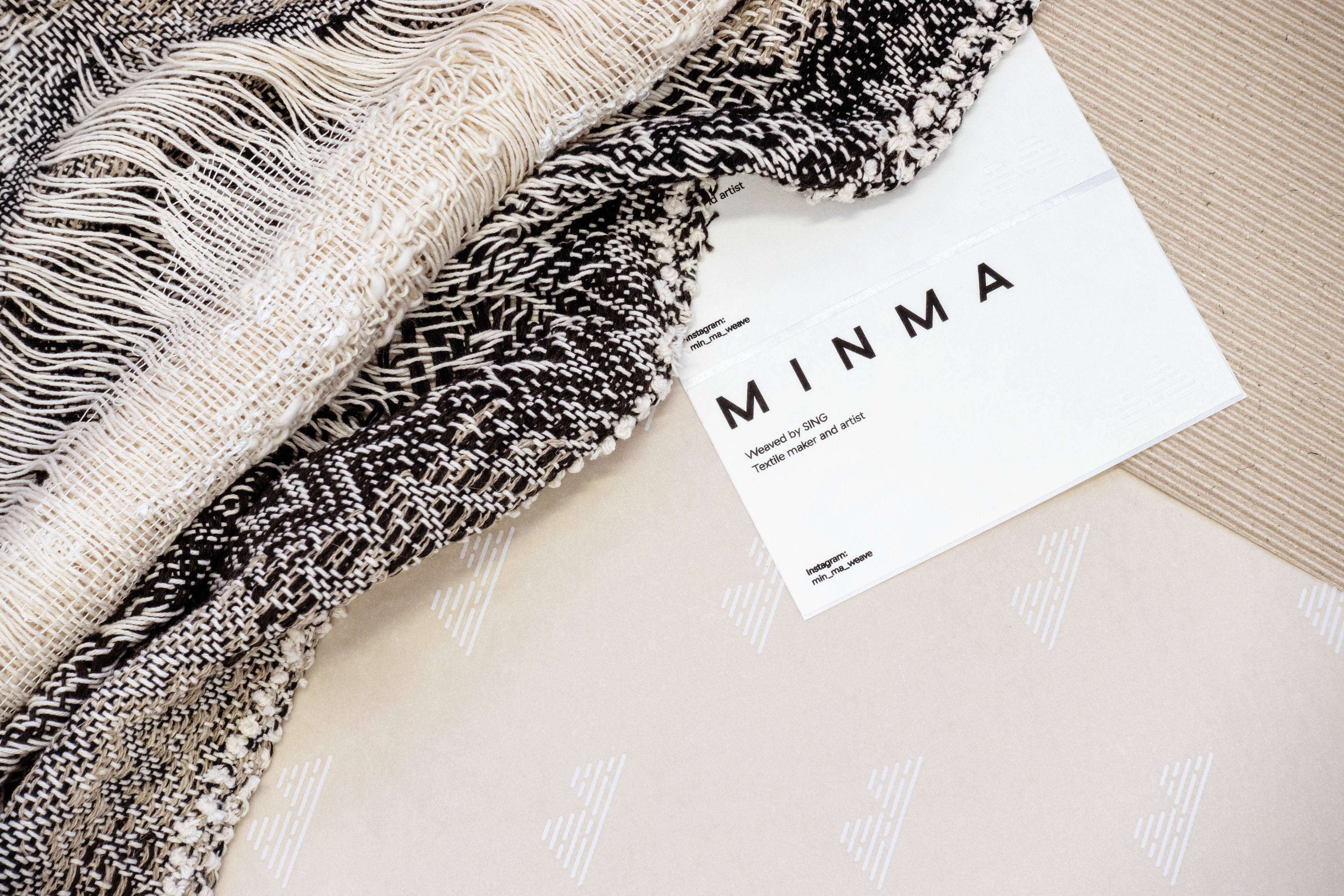
MINMA 是香港織布人Sing的品牌。在初次的訪談中,我們得知Sing閒時喜歡呆着看山,作品往往帶有大自然的色彩及元素:山脈、波浪、流水……我們希望把大自然元素——創作人織布的靈感來源一併放進「棉麻」的標誌設計。「棉麻」是一個人手織造的品牌,我們以線作為標誌的主要視覺元素,直接明瞭地讓大眾聯想到品牌的内容和特點。設計中加入了模仿棉線的細節,予人手造及温暖的感覺。兩座由線組成的山給人沉穩的感覺,像織布人的氣質一樣。
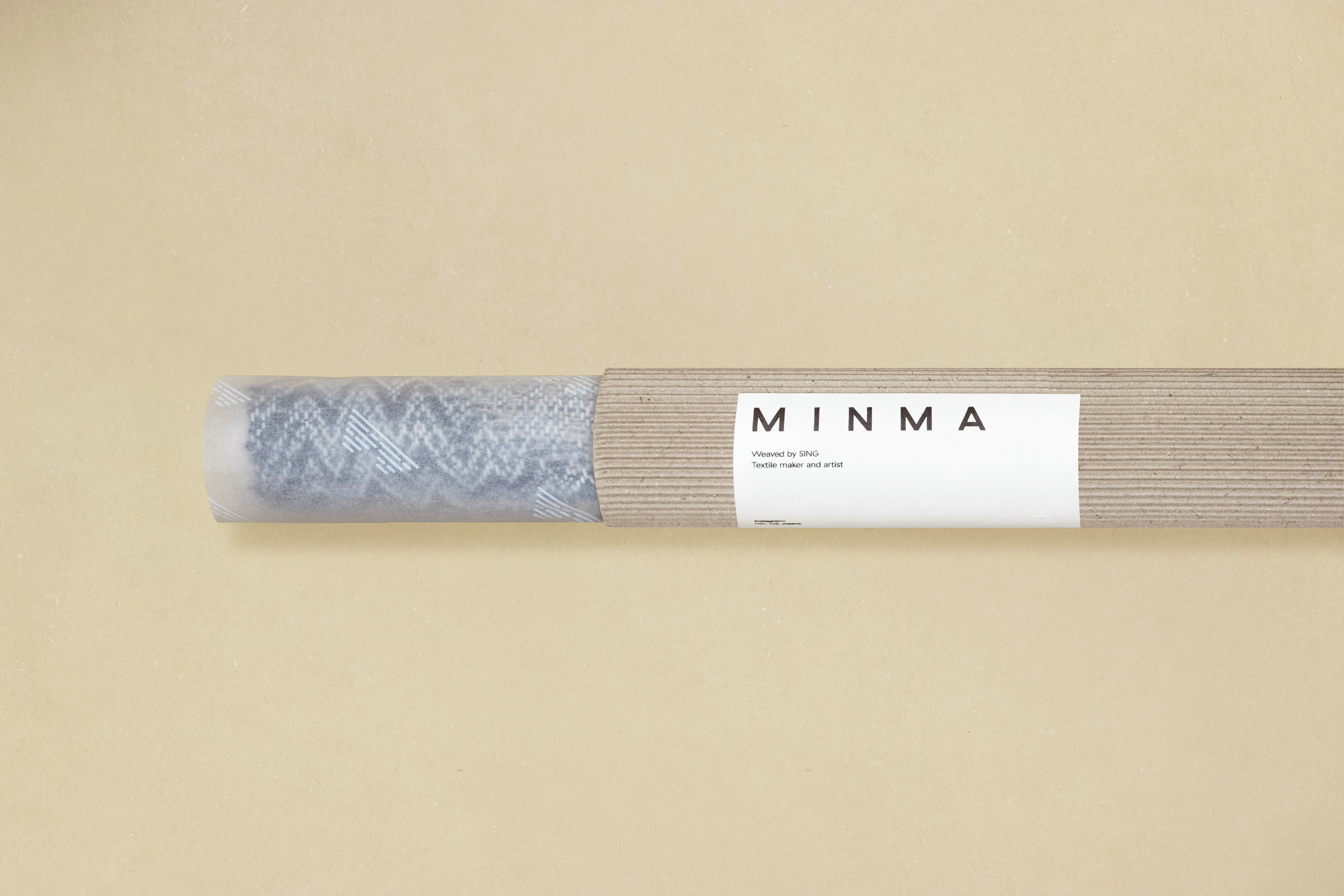
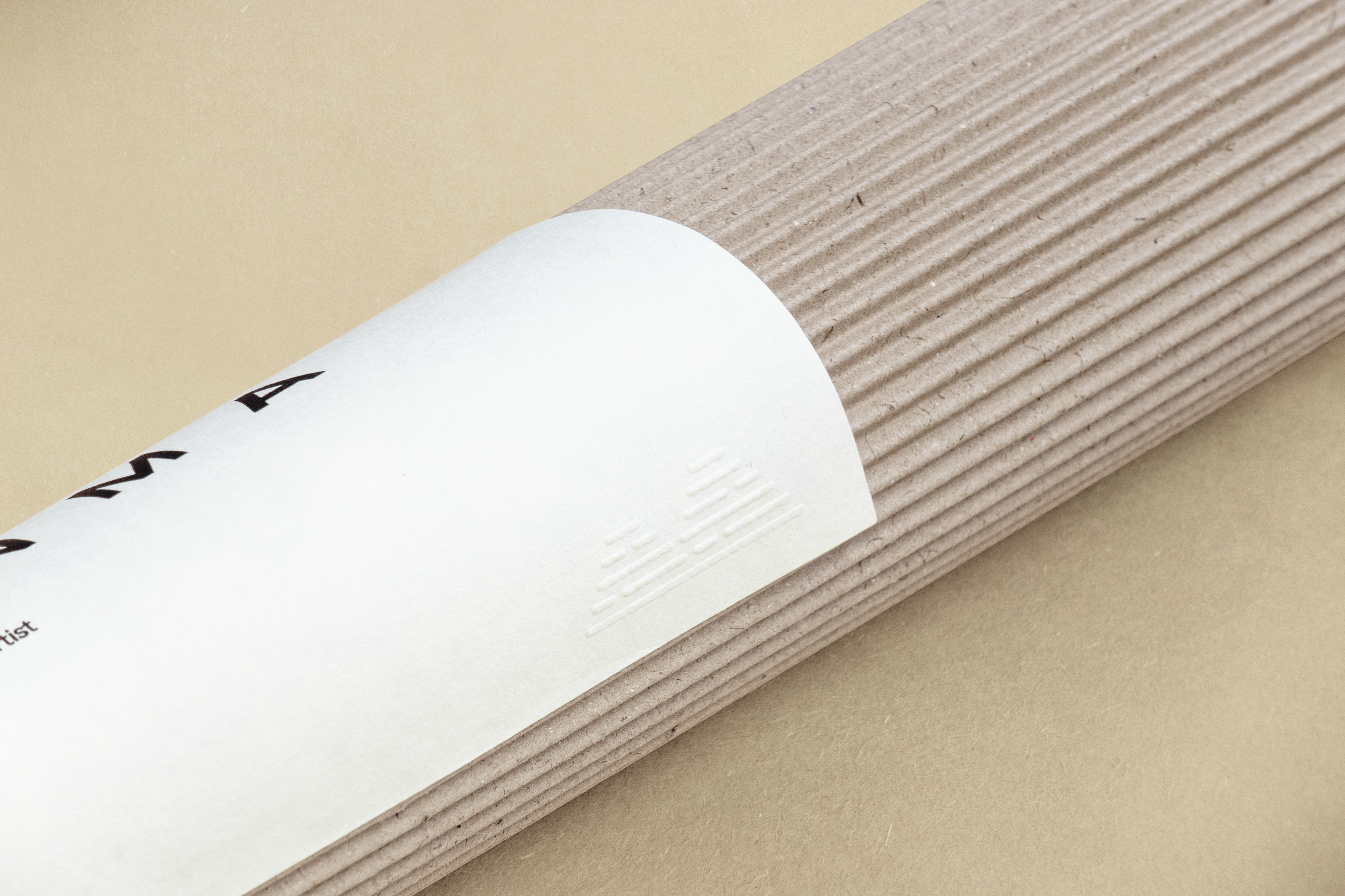
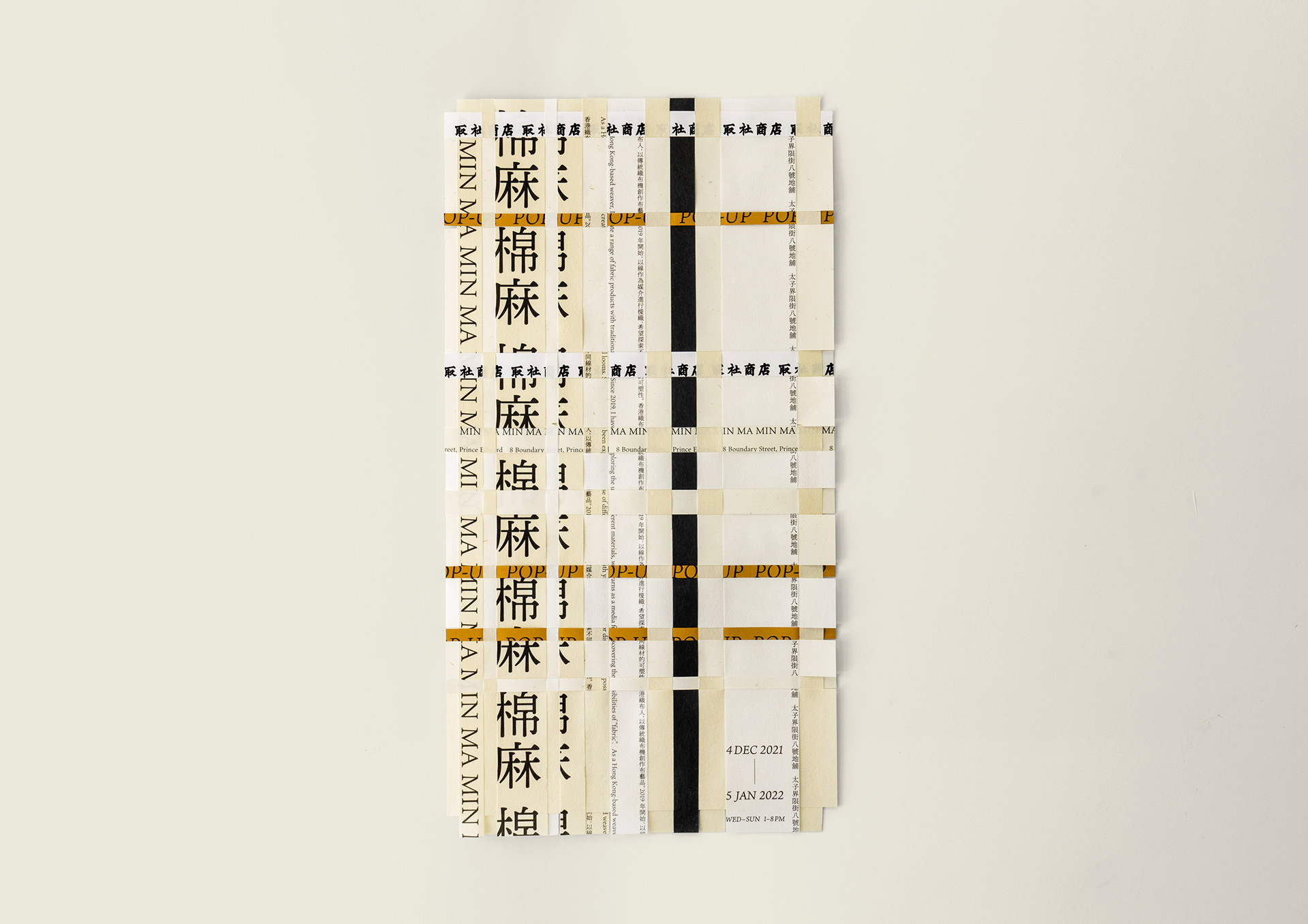
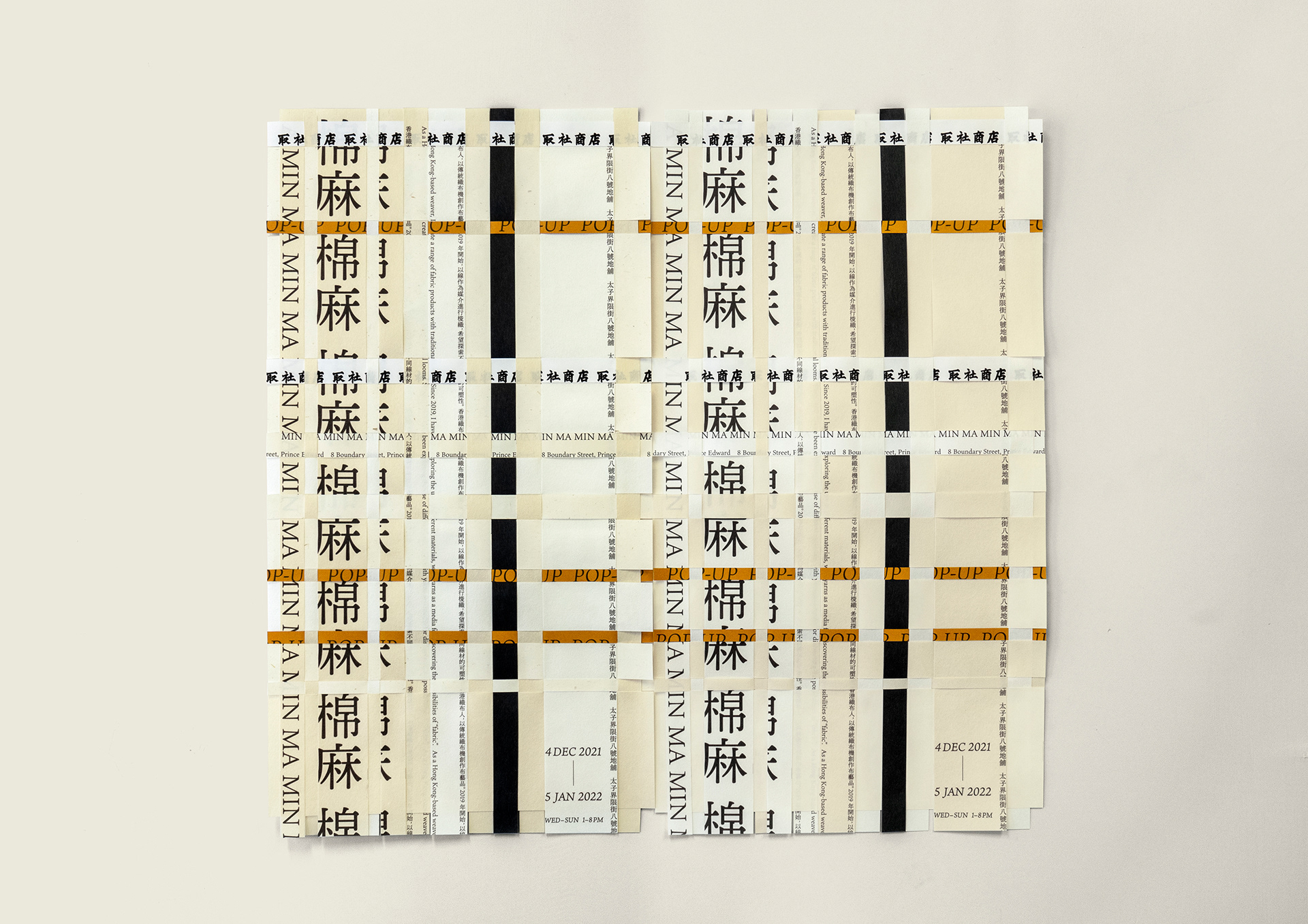
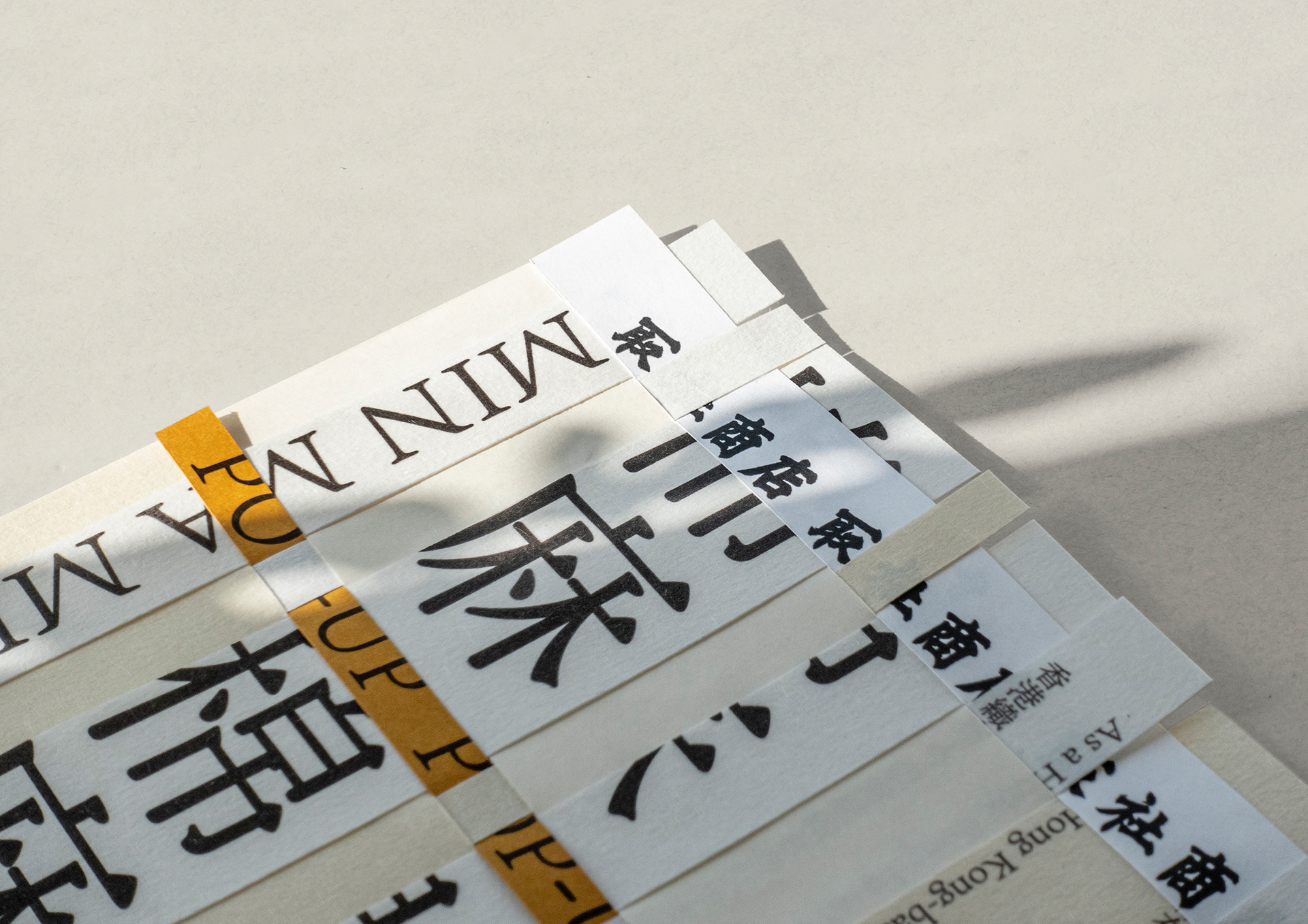
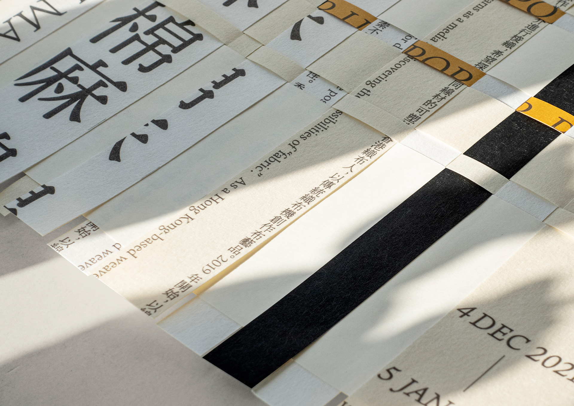
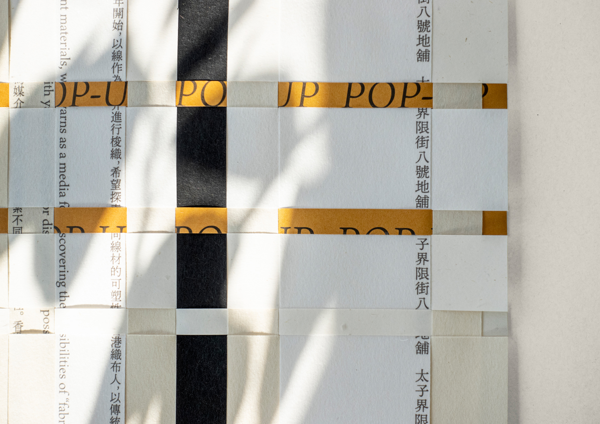
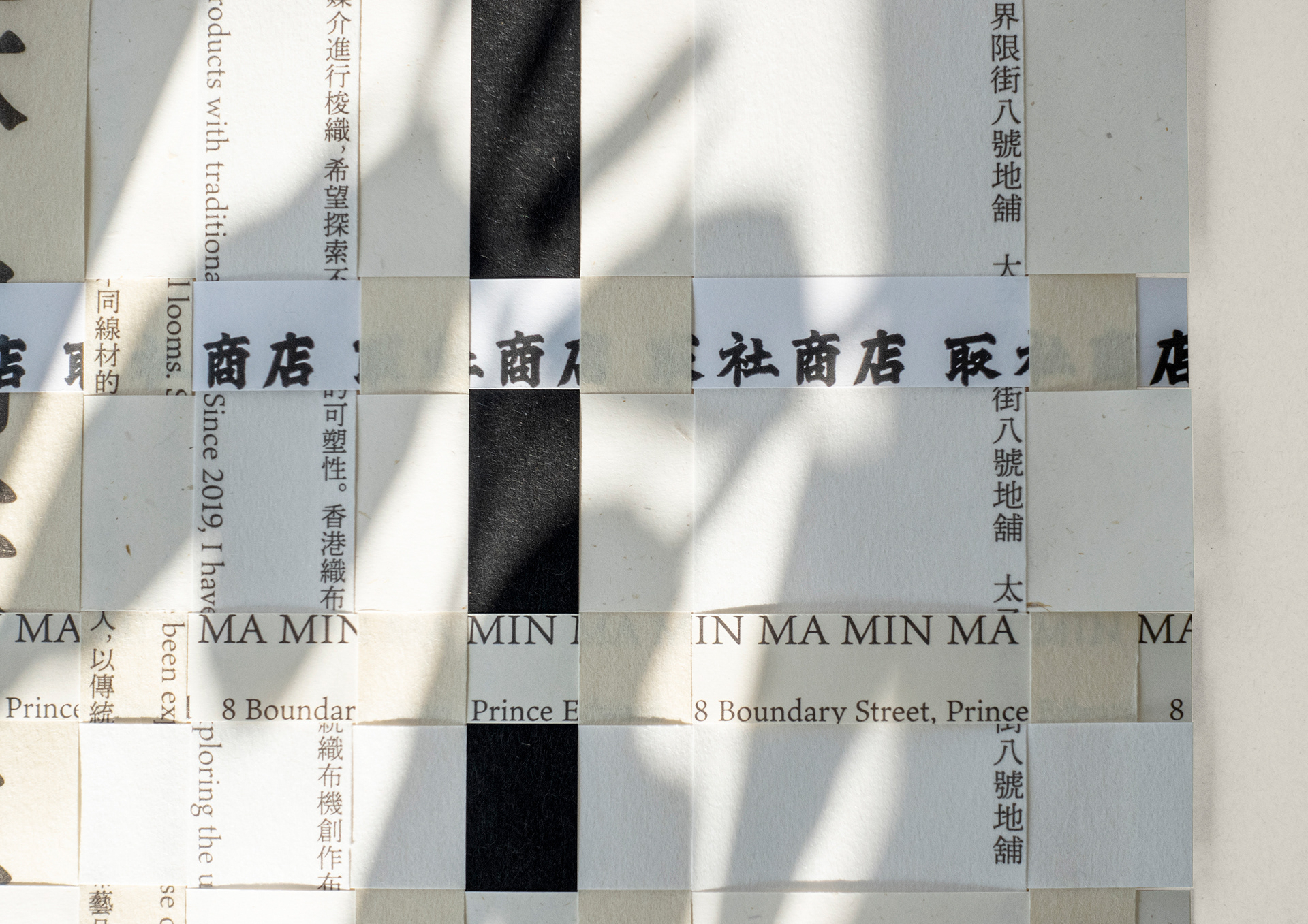
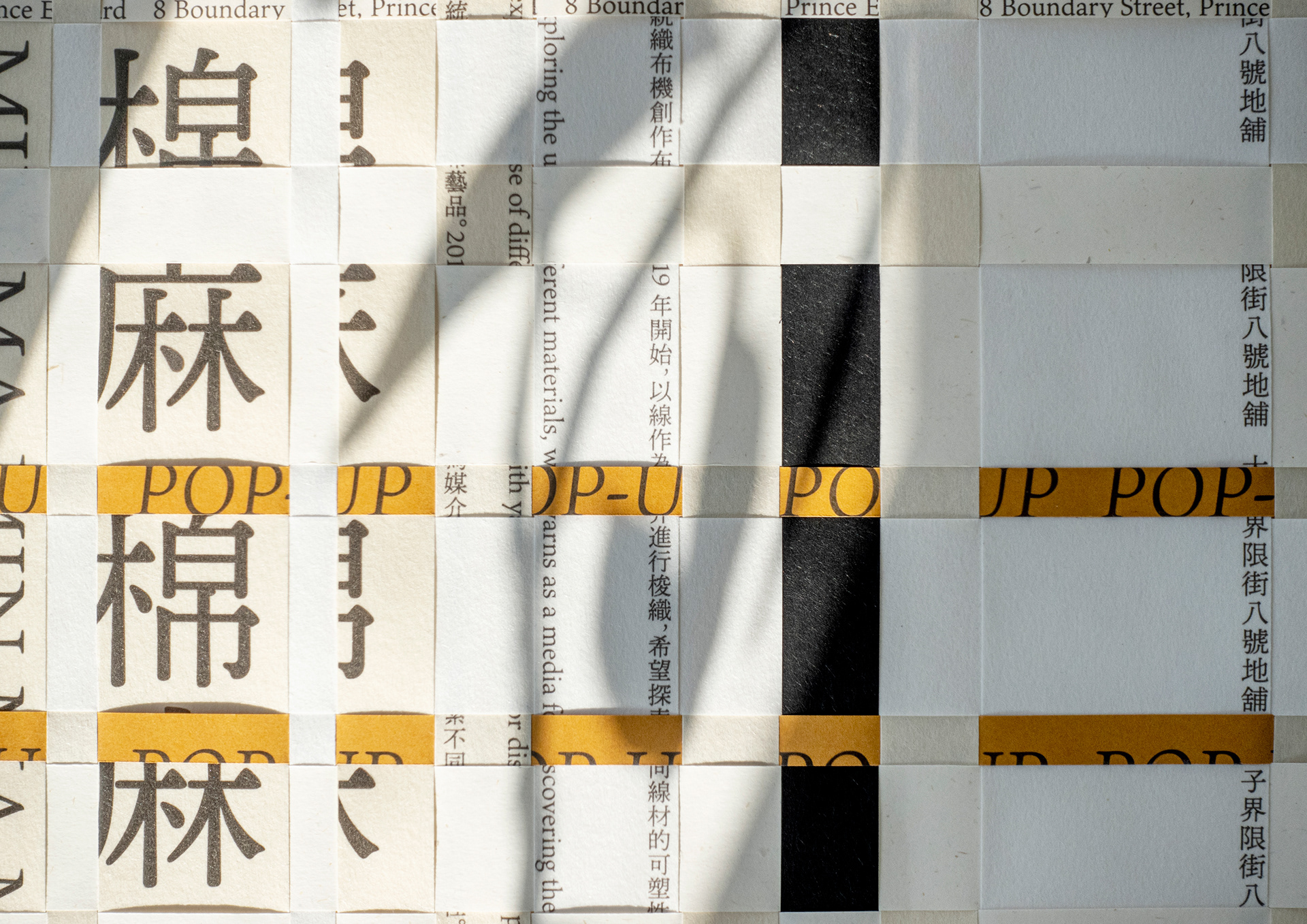
另外,我們選取不同紙材、以編織的方式創作品牌於九龍取社商店的Pop-Up宣傳海報。幾種不同質感的日本和紙及色紙,配搭出自然的色系。Pop-Up的資料印在不同闊度、互相交織的紙條上,形成特顯織品主題的視覺效果。
MINMA is an original brand founded by Hong Kong-based weaver Sing. In our first encounter, we learned that he enjoys spending time in the mountains in his free time. His fondness of nature can be seen in the natural colours, patterns and textures of his woven works. We wanted to incorporate his source of inspiration — the mountain ranges, waves and streams — into the brand’s logo design. To emphasise all MINMA productions are handwoven, we chose to use threads as the main design element in the visual identity, directly referencing the brand’s characteristics and giving a sense of warmth. The threads form two mountains in the logo, which is consistent with the maker’s dependable, steady personality.
For the promotional poster of the brand’s pop-up at the Simple Legend Shop in Kowloon, the use of different types of washi and colour papers create a natural, comfortable combination of textures and hues. The pop-up’s details are printed on strips of varying lengths, forming a warp and weft fabric made of paper.
Client: MINMA
Identity & Poster Design: Nous