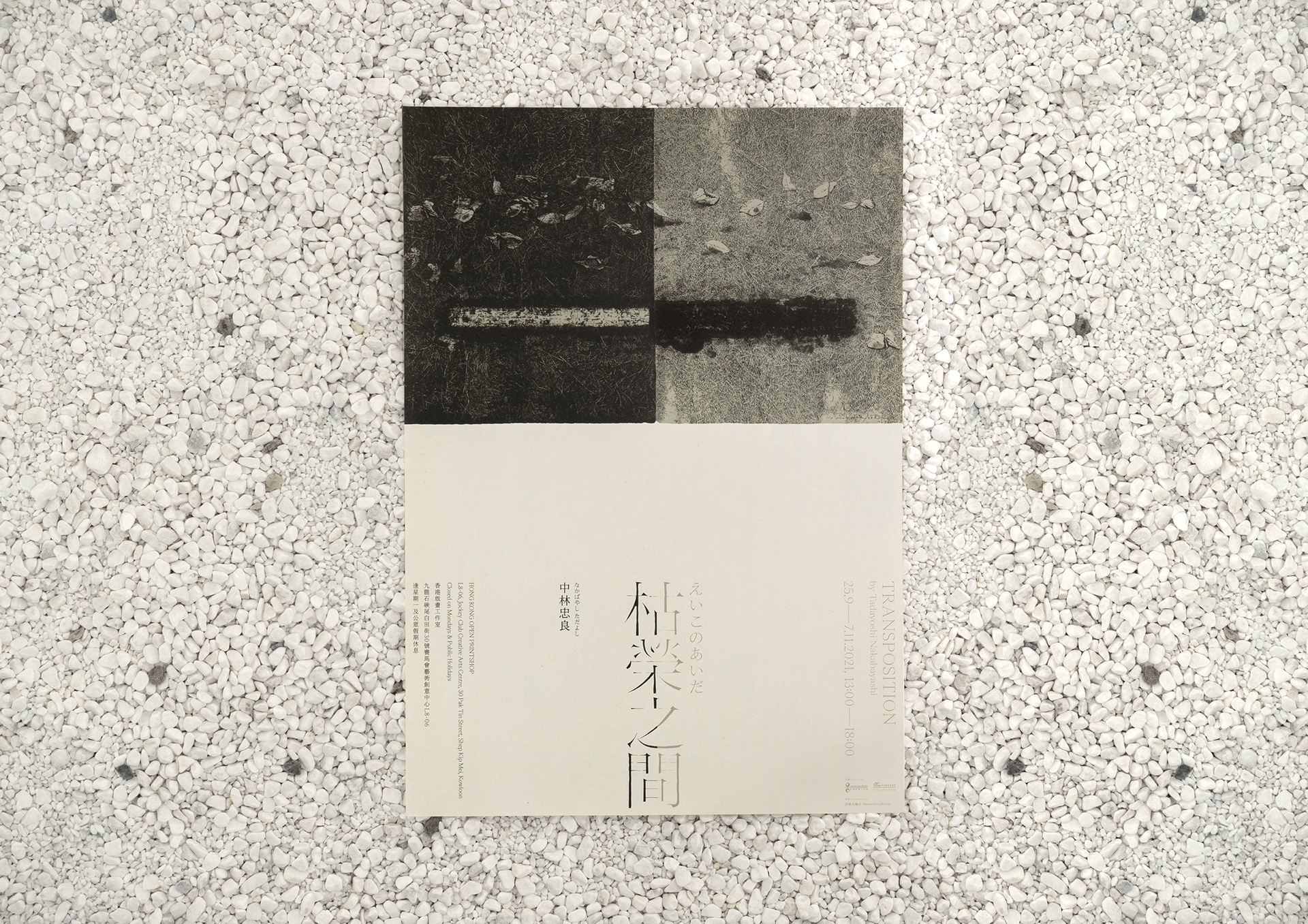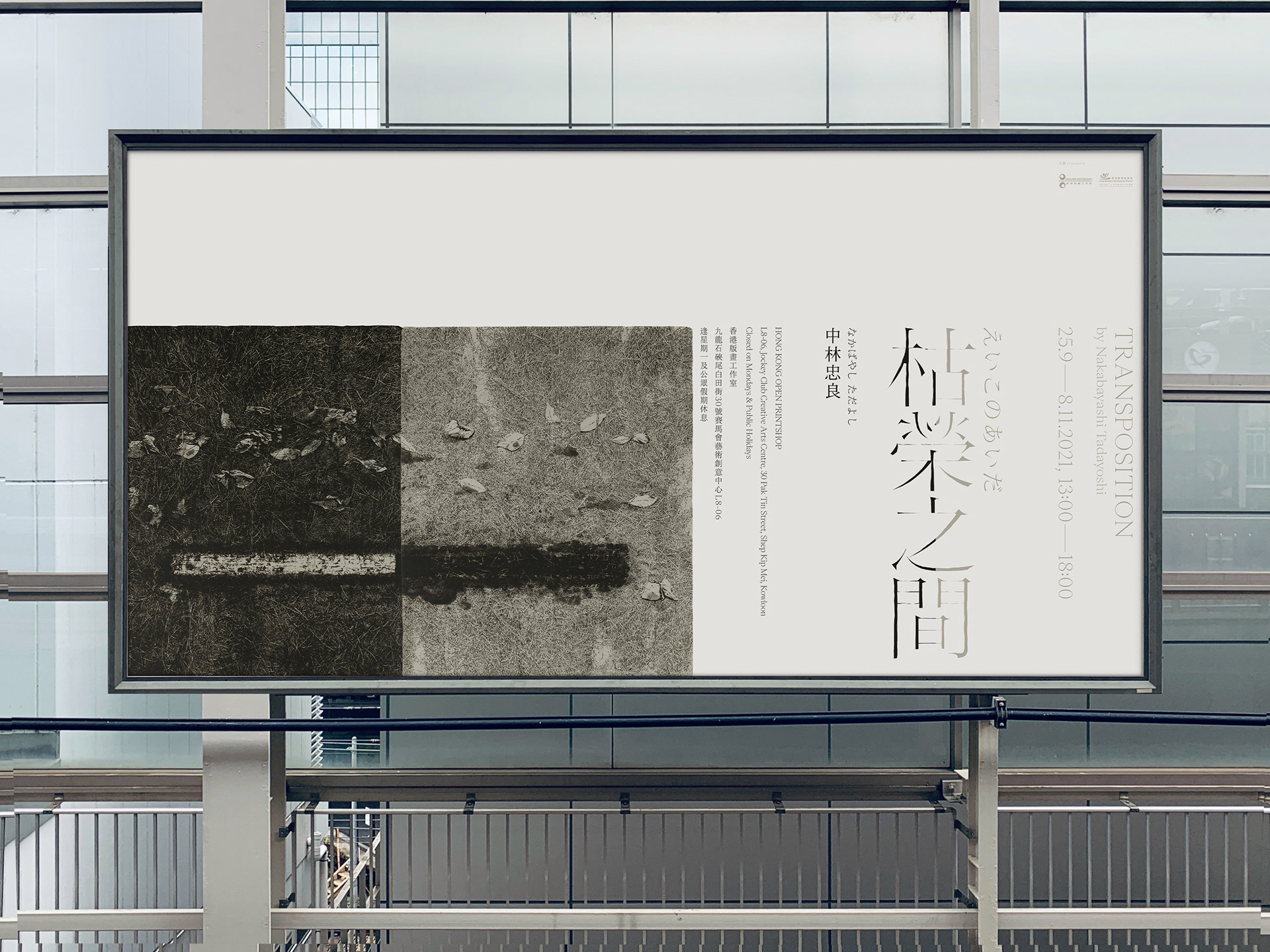
中林忠良:枯榮之間
Tadayoshi Nakabayashi: Transposition Exhibition
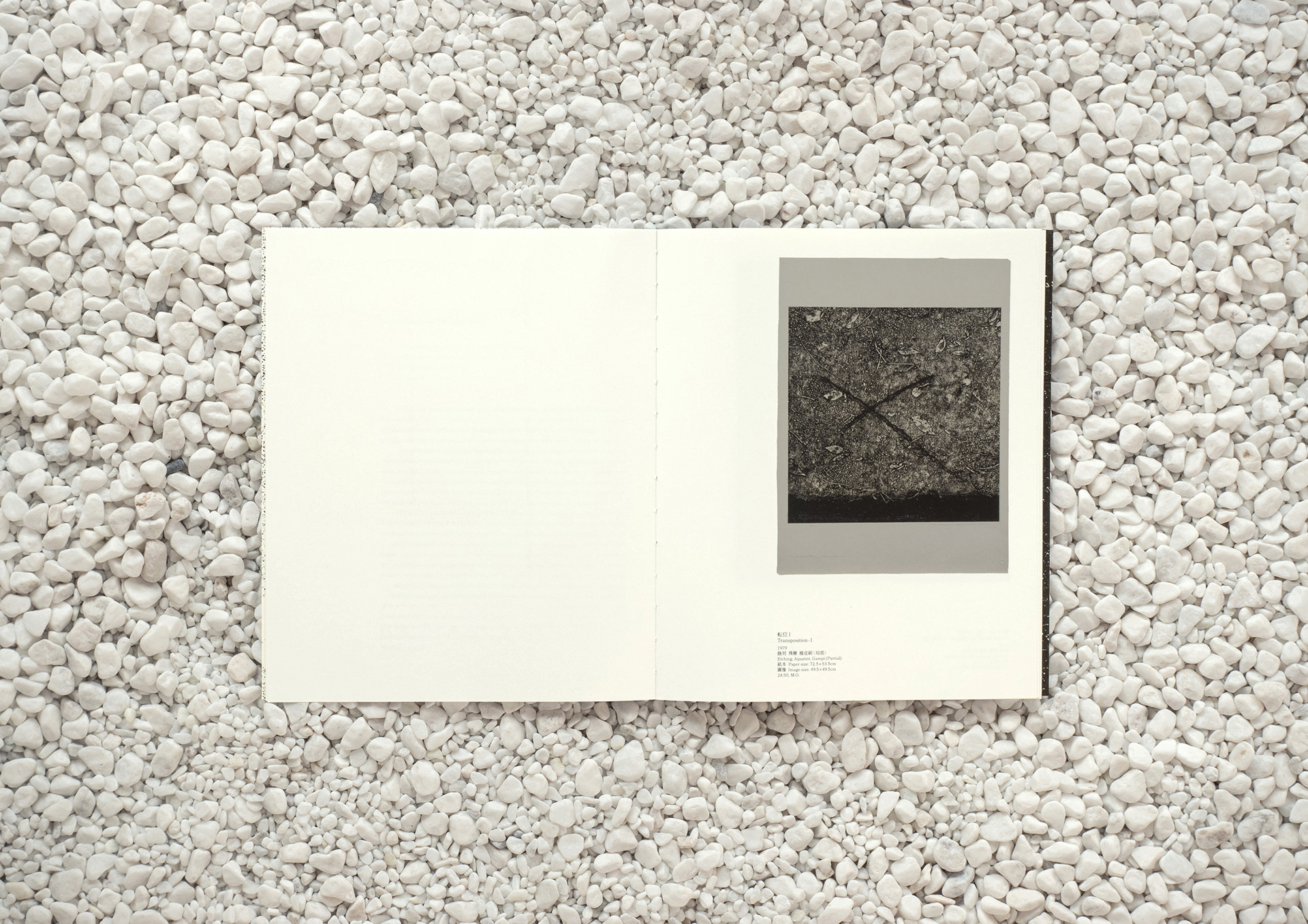
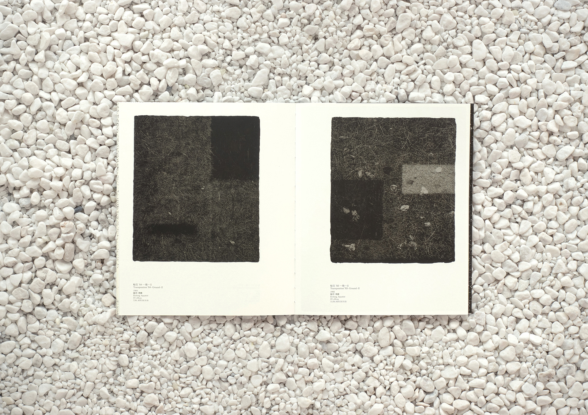
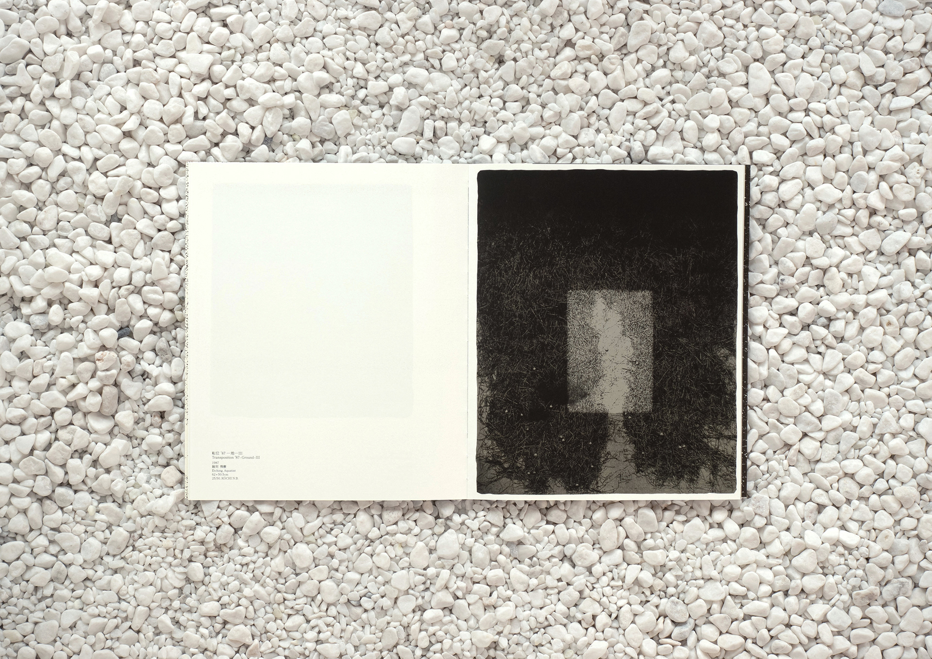
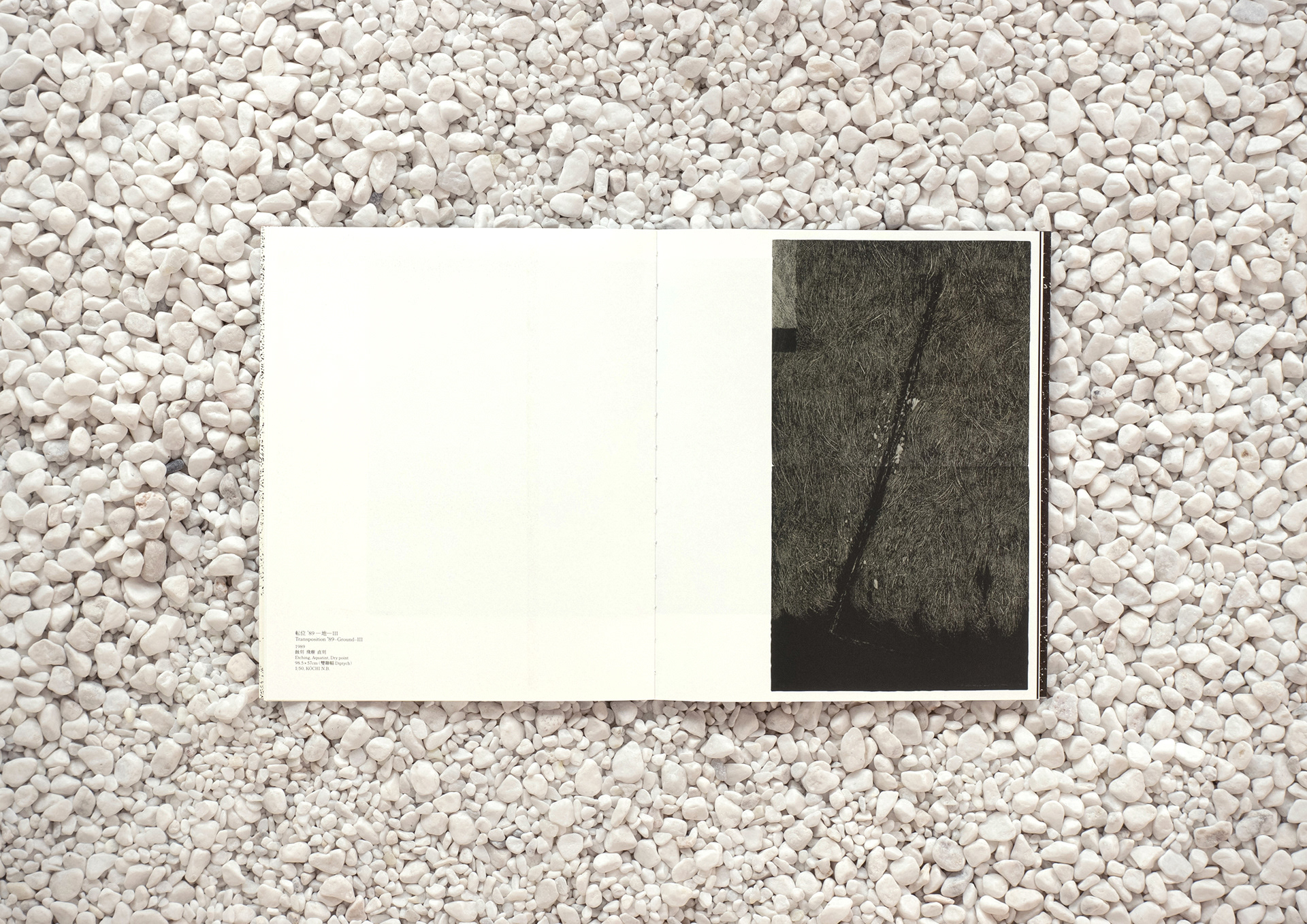
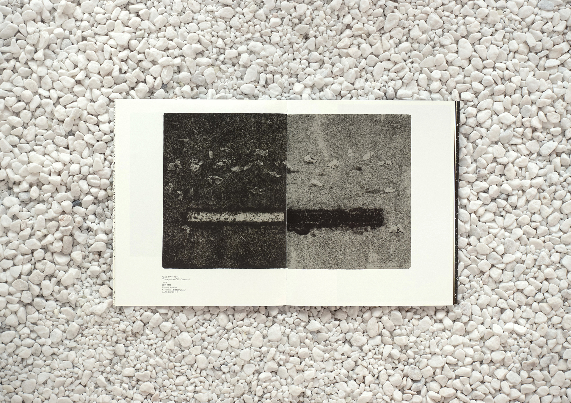
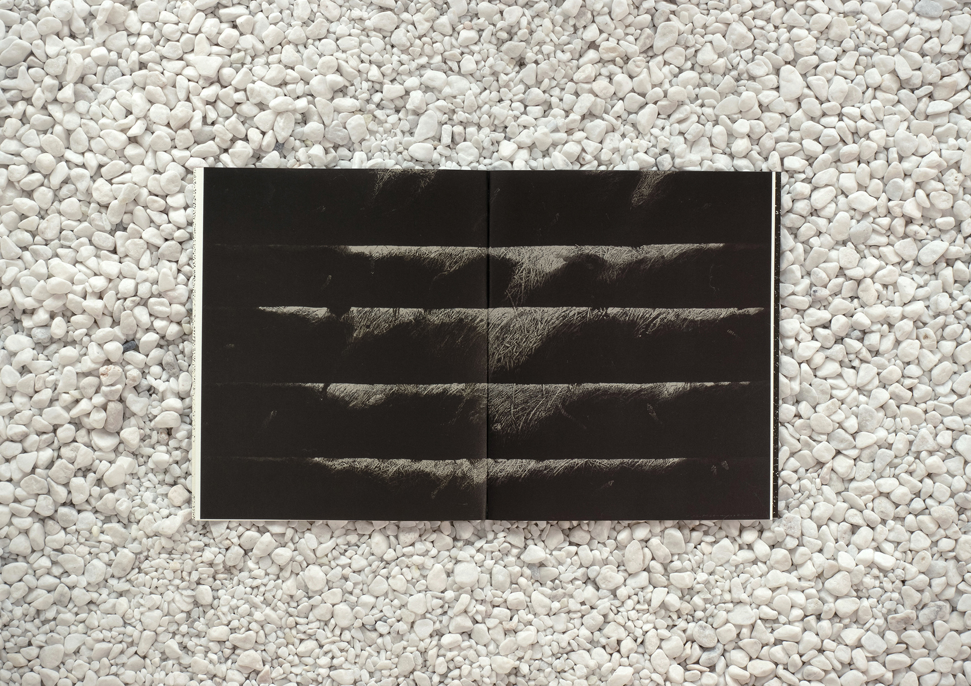
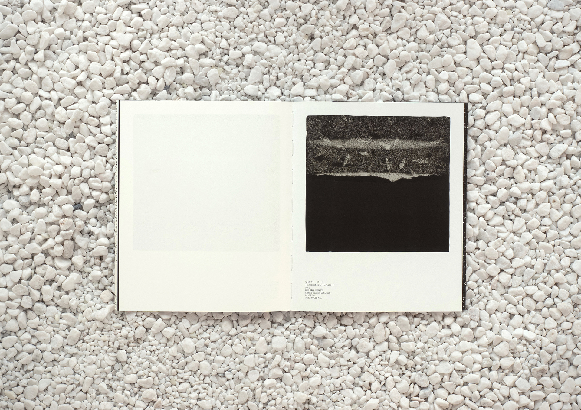
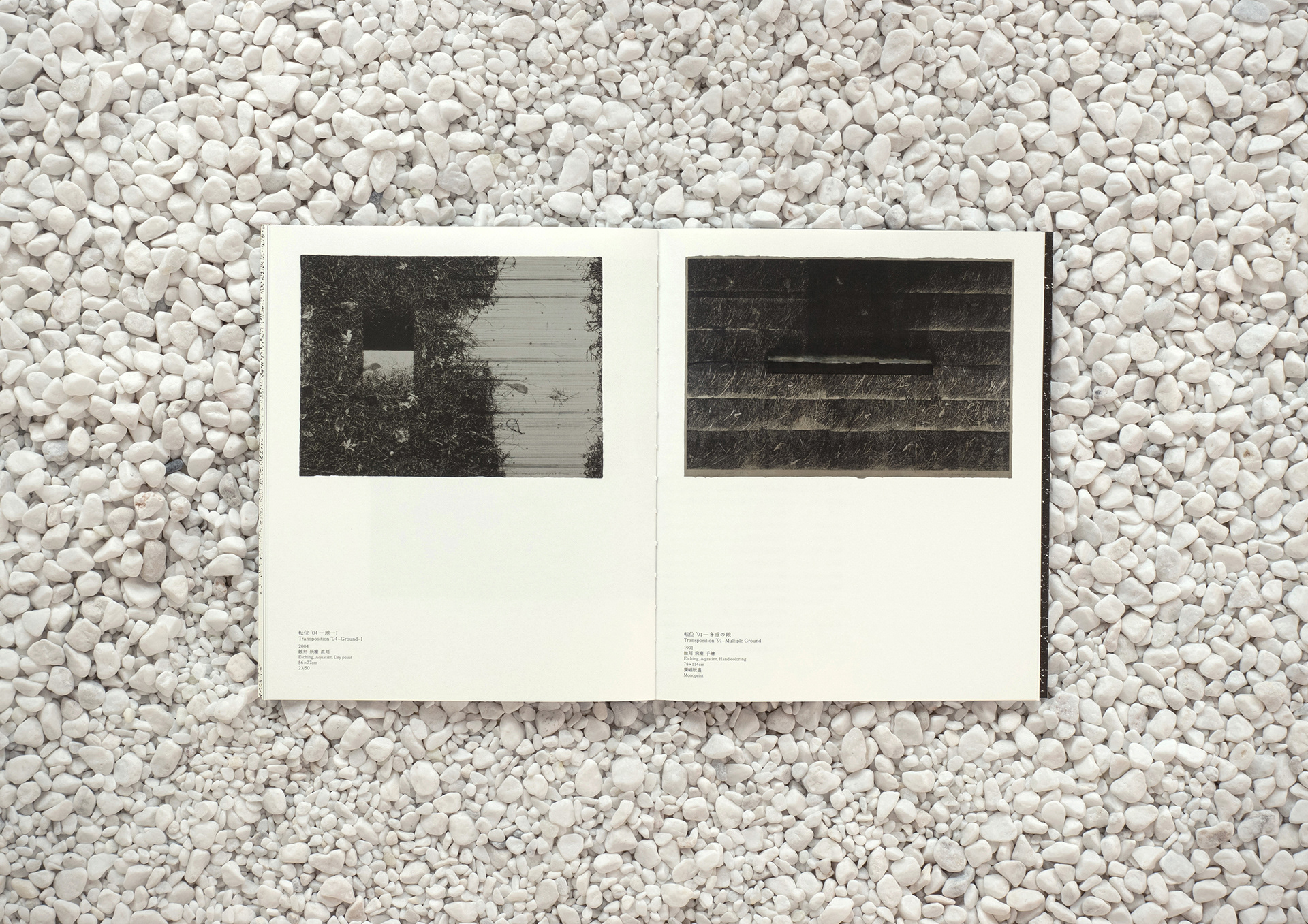
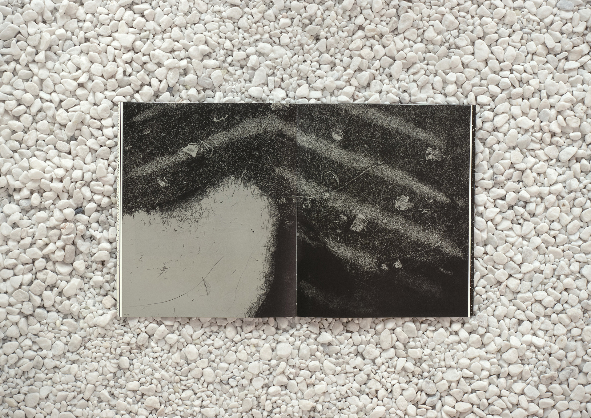
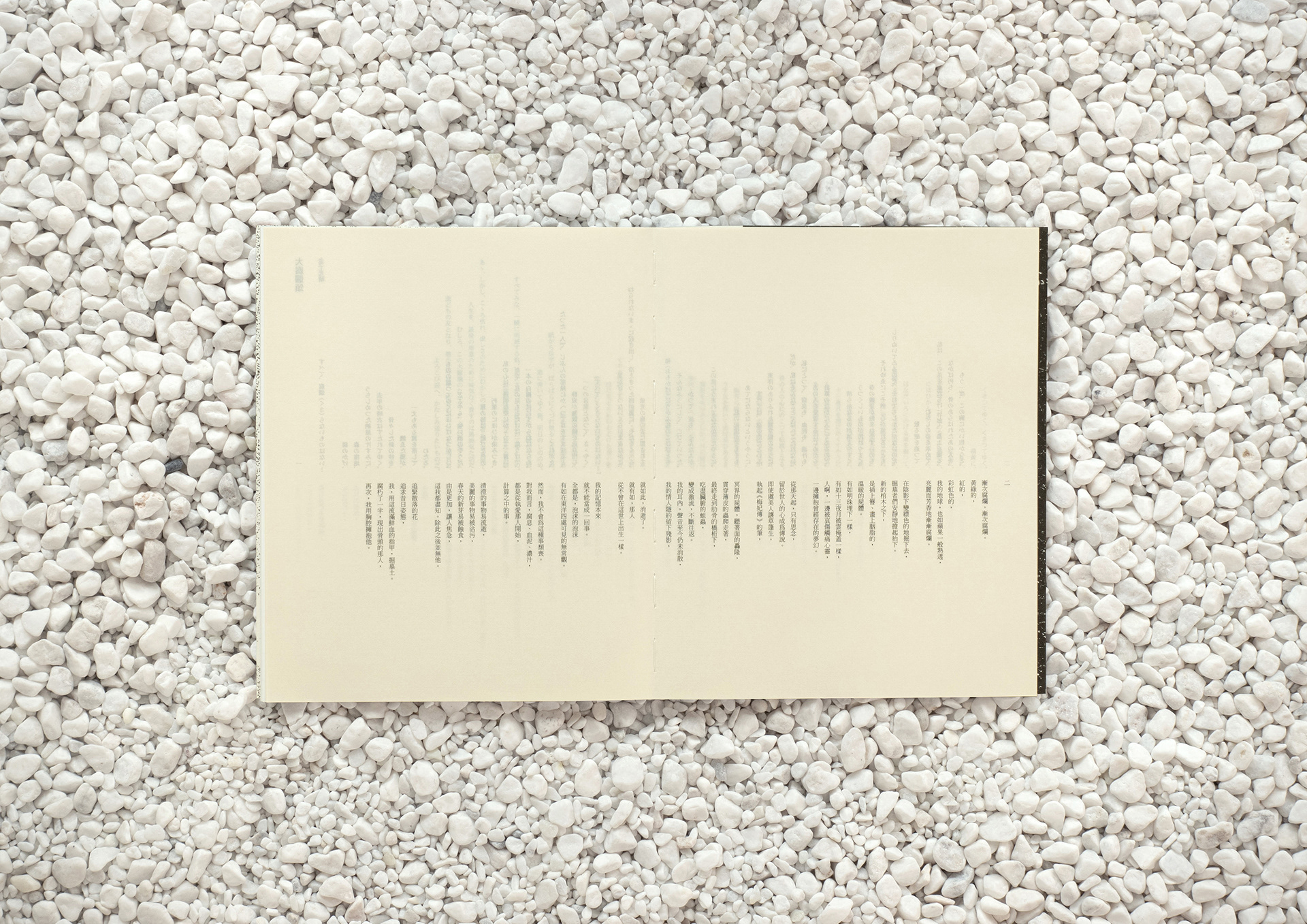
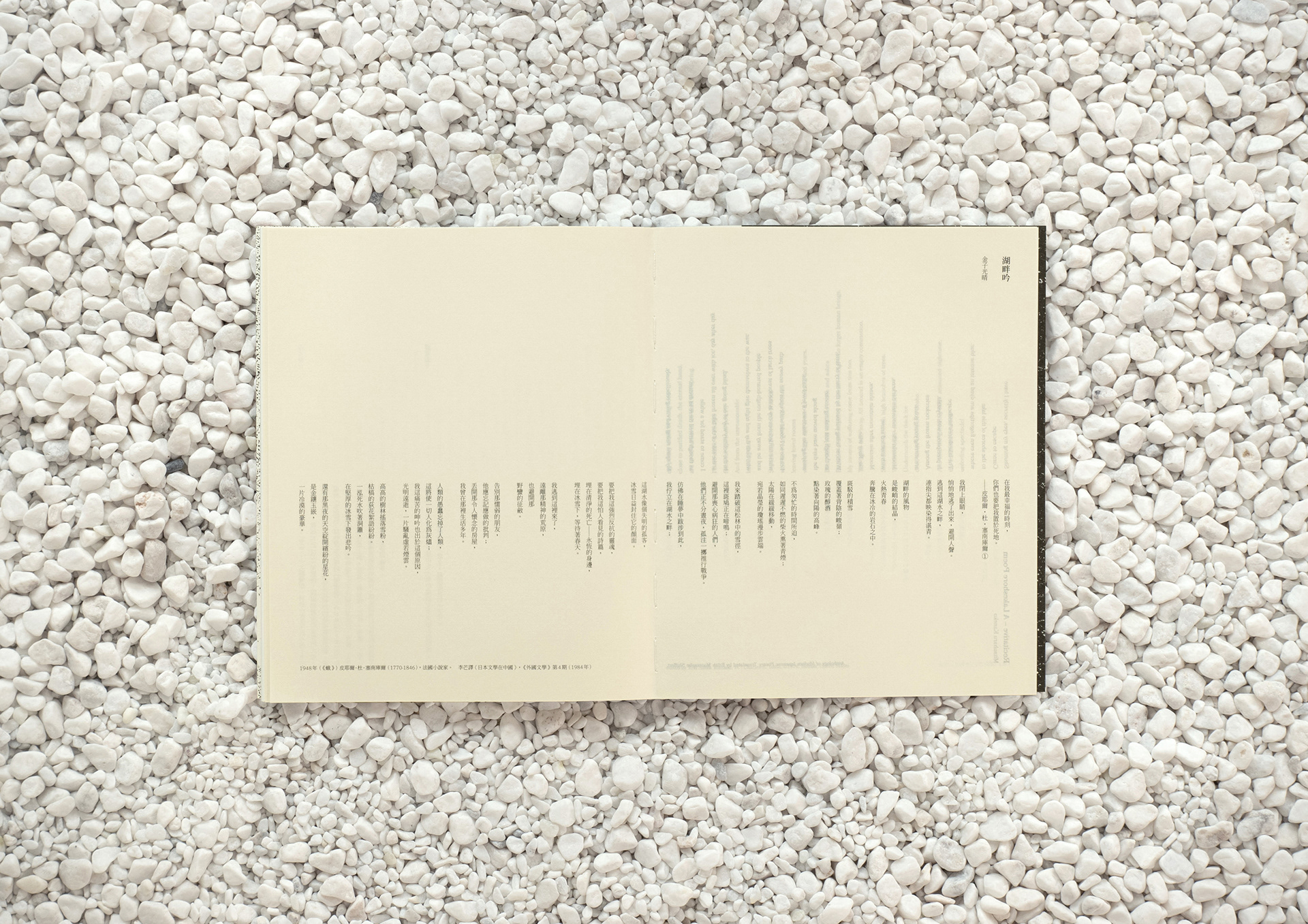
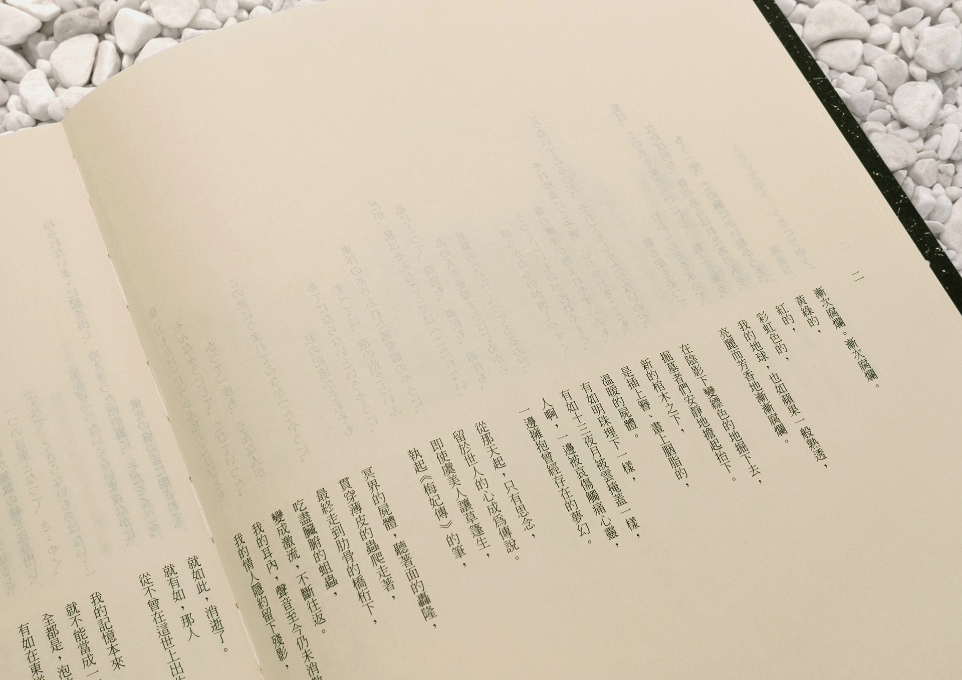
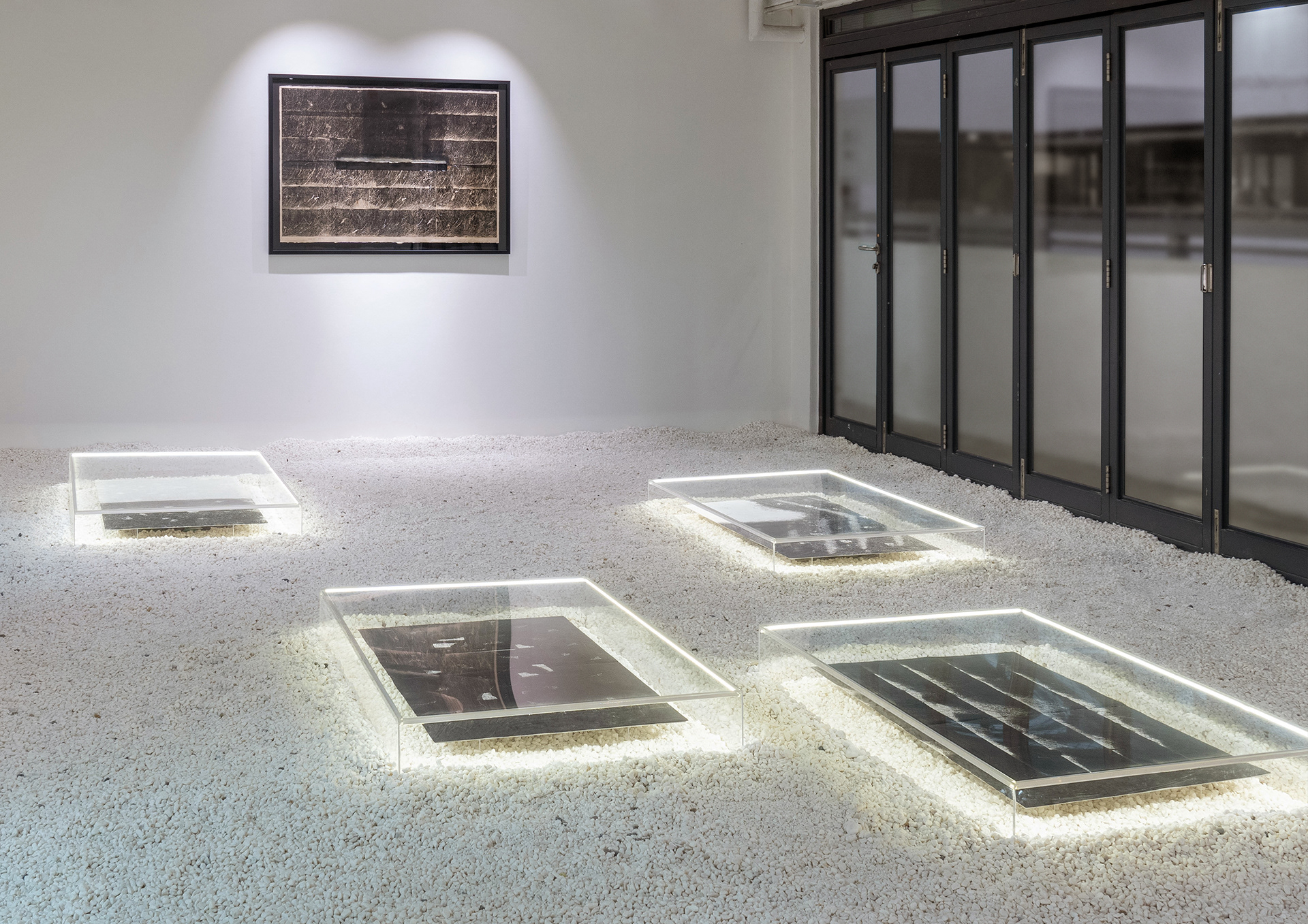
《中林忠良:枯榮之間》是日本國寶級版畫家中林忠良於香港的首個展覽,展出《転位——地》(Transposition — Ground)系列的蝕刻銅版畫。中林忠良先生深受日本詩人金子光晴(1895–1975)詩集—《大腐爛頌》中「沒有什麼不會腐爛」的詩句啟發,以大地草木的枯榮交替來表達此母題。我們第一次近距離觀看他的作品,便深深的被雁皮紙上極其細緻溫柔又自然、黑白對比分明的蝕痕肌理紋路所震憾。他對美學的傳譯,在其畫面佈局中表露無遺。
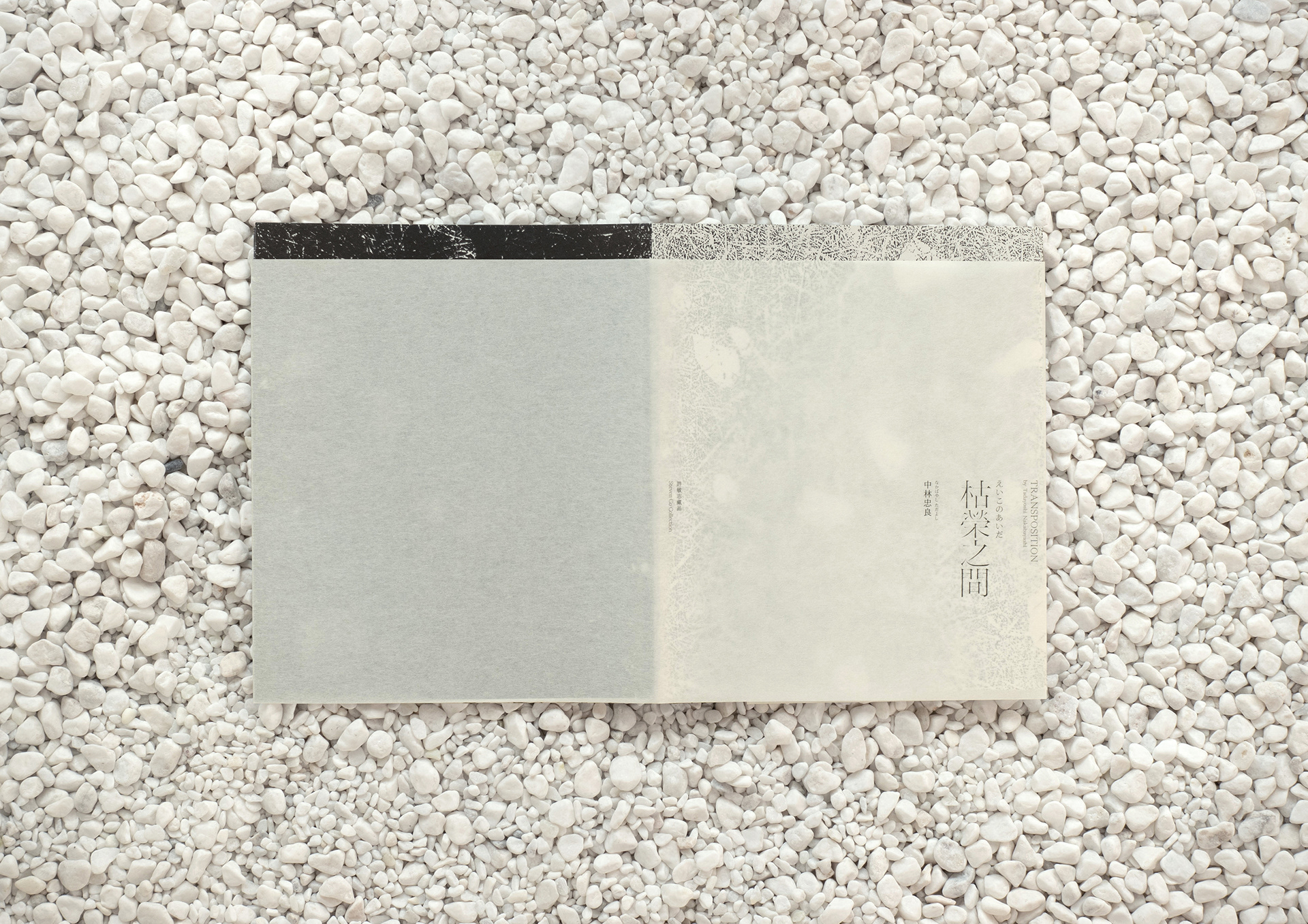
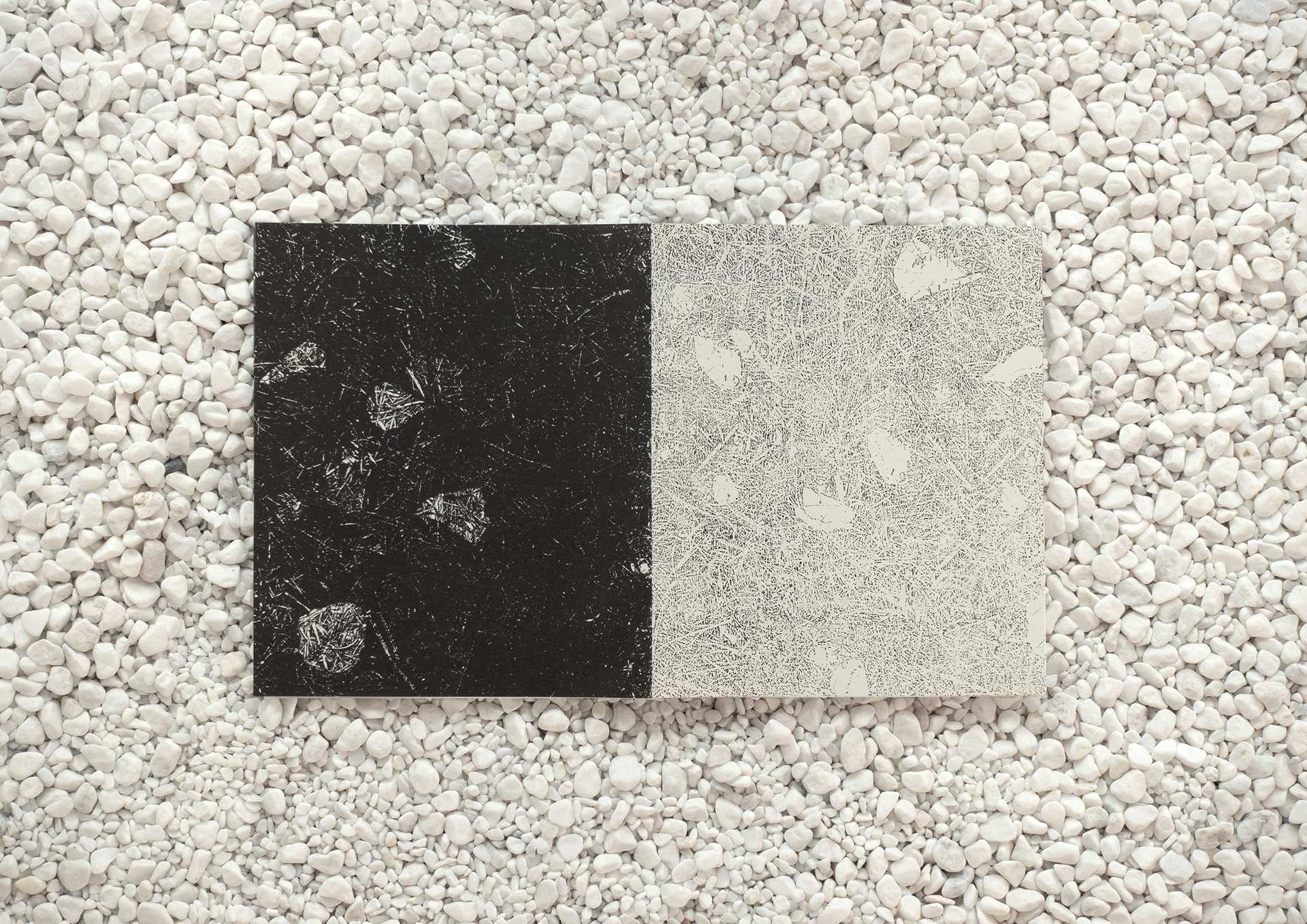
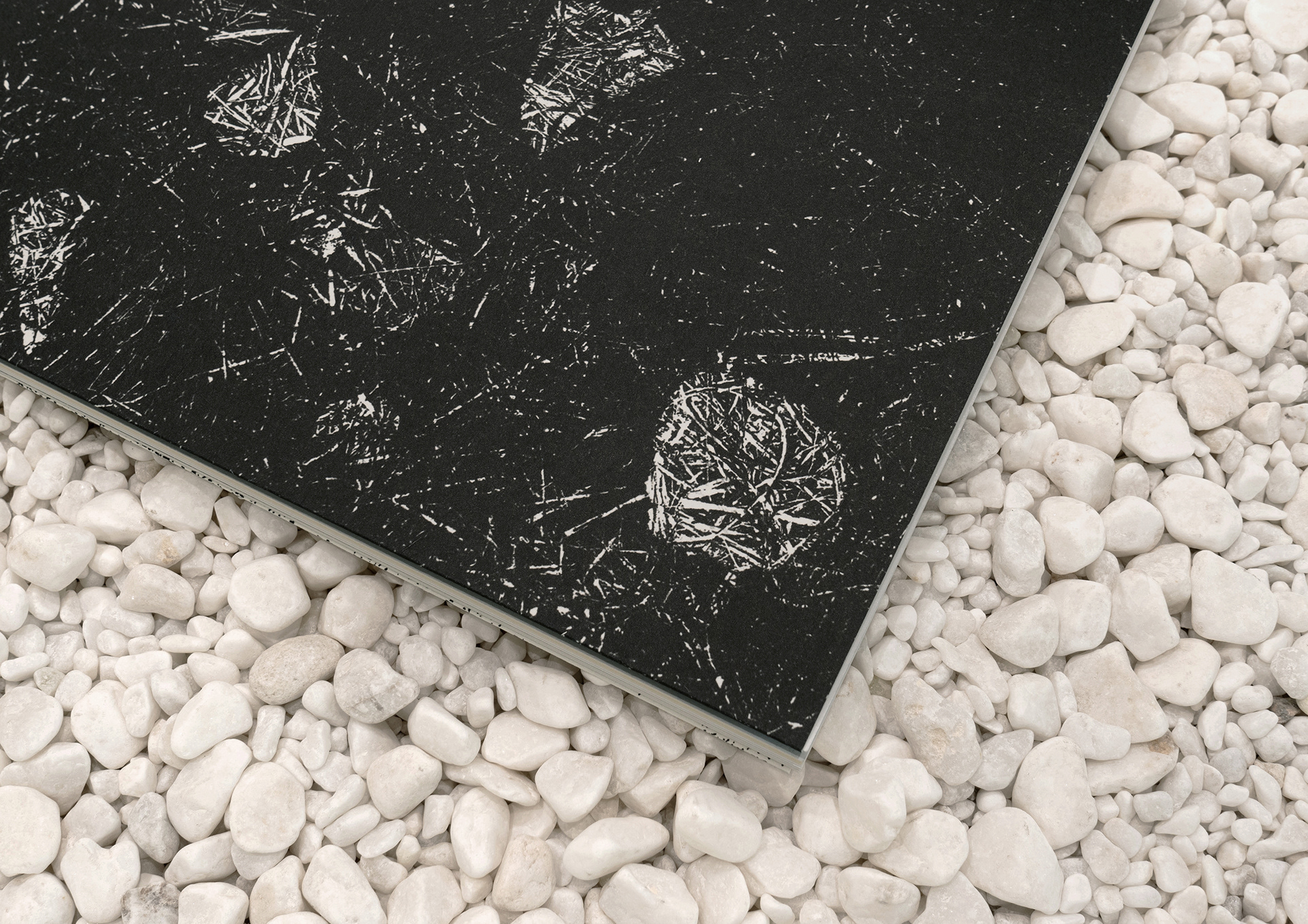
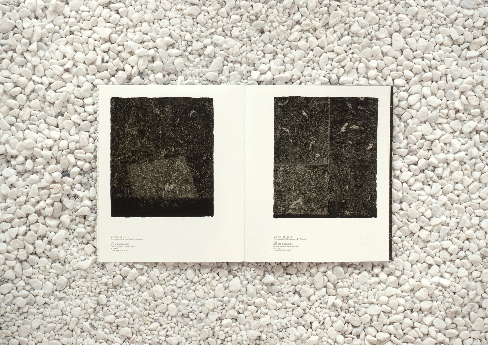
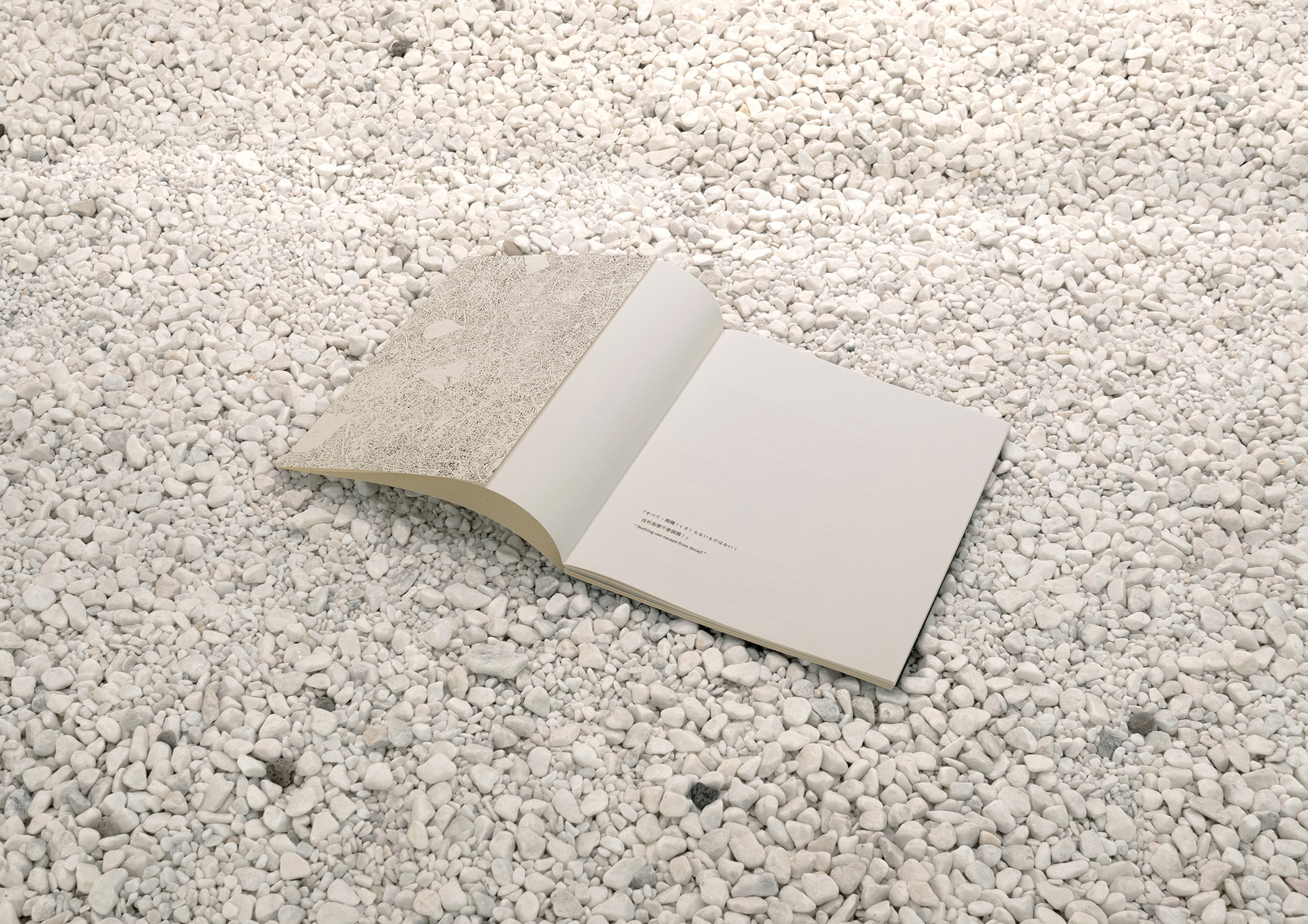
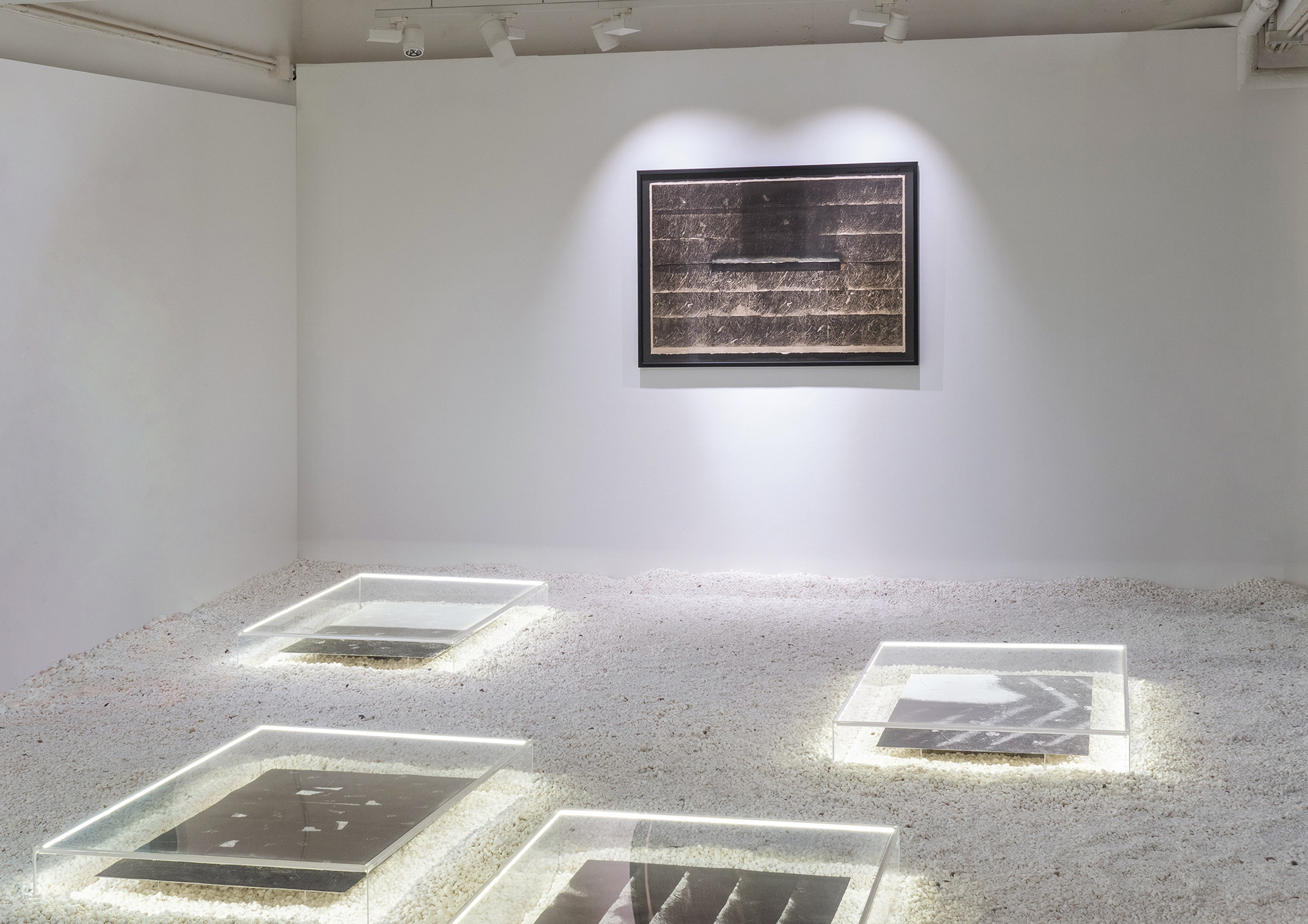
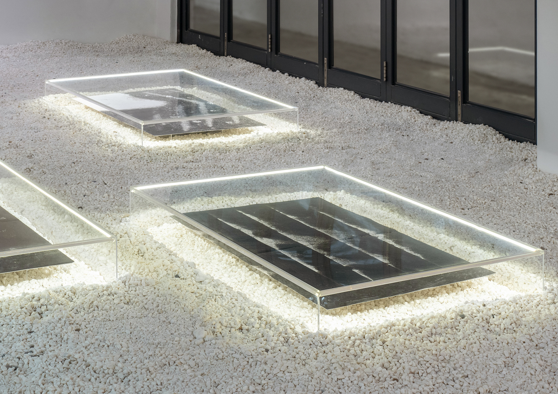
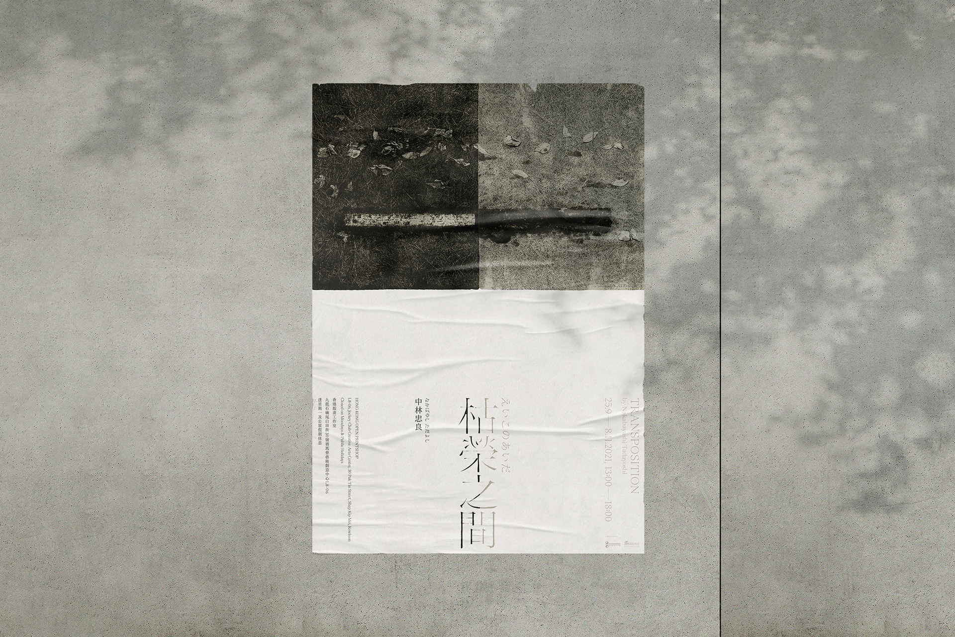
銅版畫作品中的黑與白,即光與影。我們在主視覺中利用黑白之間的衝突與調和,以及版畫作品與文字之間的留白表達展覽主題。在作品集中我們不希望有多餘的「設計」,以求這個載體能全然融入藝術家的作品。為了讓讀者感受到書本與展覧一體流暢的視覺體驗,書脊沒有刻意加上壓痕和文字。前後封面打開展示的正是中林忠良於1995年創作的《転位 ’95—地—V》。一黑一白的書體和書脊,巧妙地呼應着展覽的主視覺。
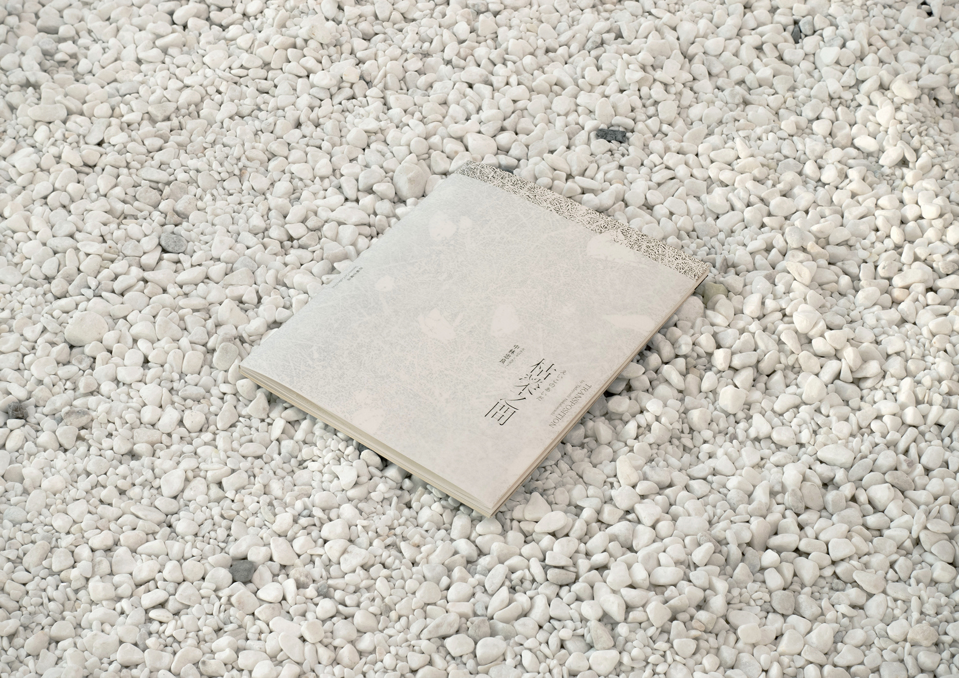
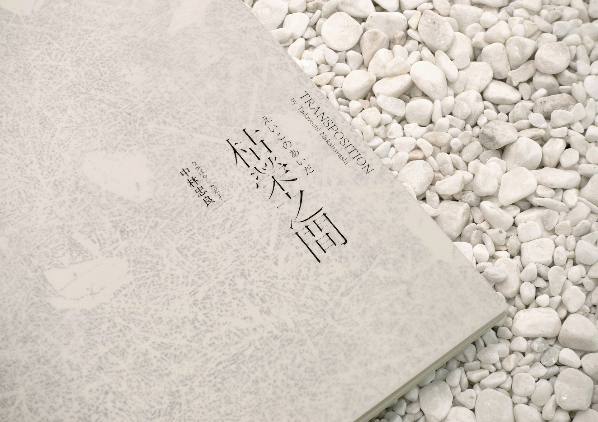
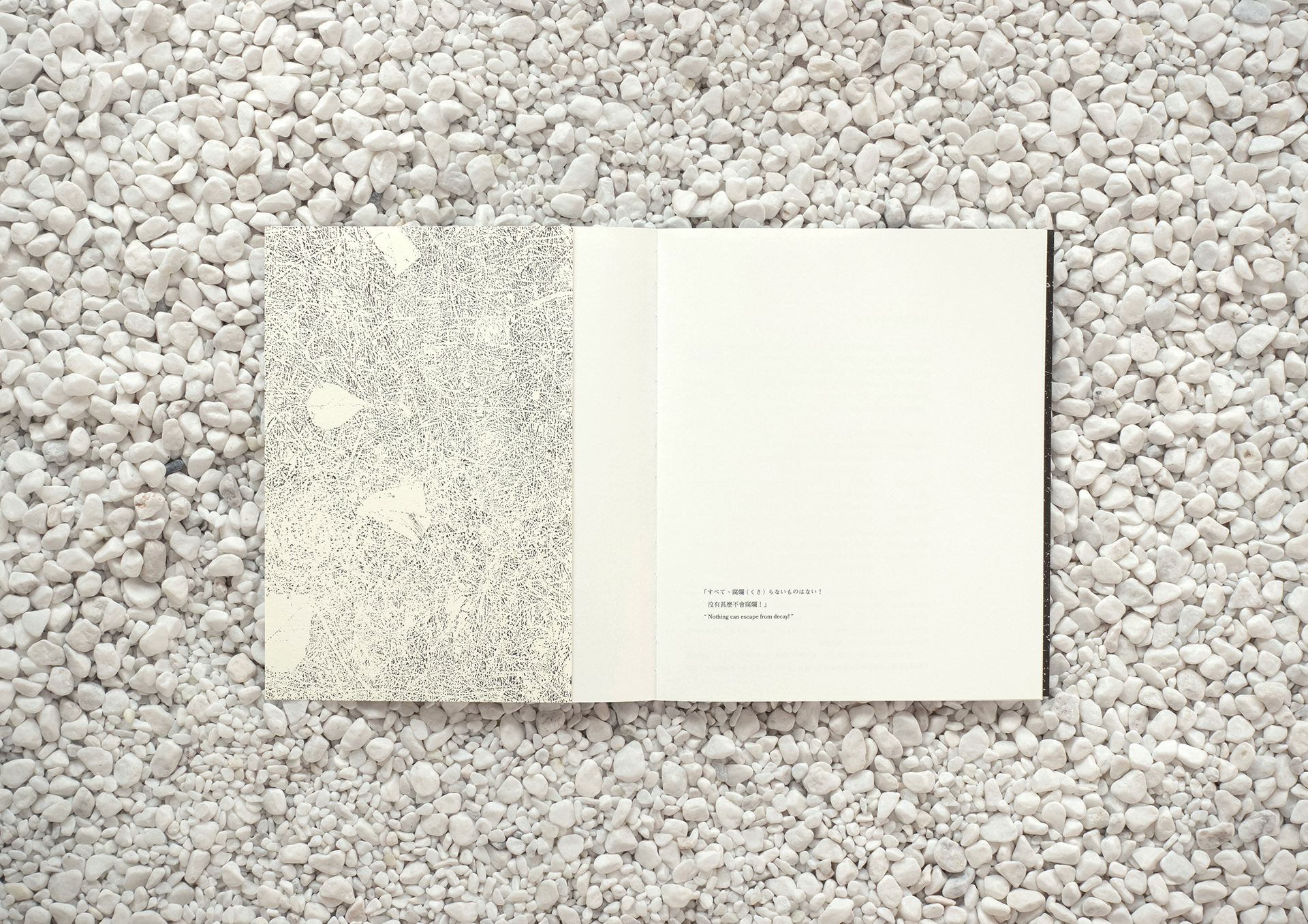
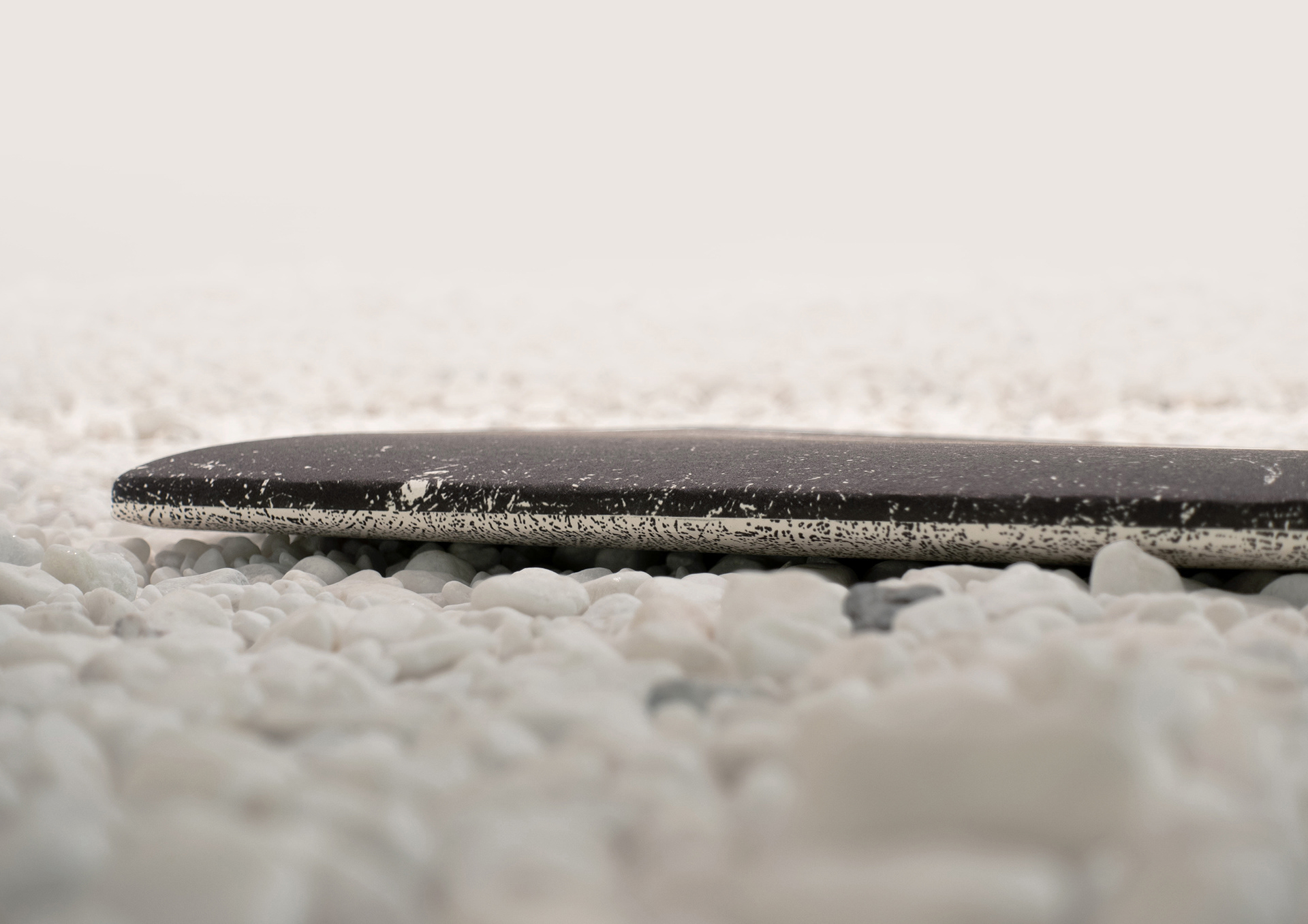
書本的柔軟度是其中一項我們在意的重點。第一層封面選紙為60 gsm日本竹尾TELA 薄和紙〉。「TELA」一詞源自於西班牙文的「布 / 薄皮」,表面帶有同類紙材沒有的細長纖維,十分柔軟但格外堅韌。讀者將書本捧在手中的一瞬間已可感覺到纖維紋路的流動方向,並隱約看見紙張底下印有的作品。在封面上的標題字體設計由斷續的極幼線條組成,彷彿模仿雕刻過程的尖銳收筆 ,突顯蝕刻銅版畫的特色。另外,我們亦希望在封面呈現中林忠良選用的雁皮紙經壓印後的凹凸觸感,因此第二層封面選用大地紙印刷。由於大地紙表面有着粗糙如草一般的紋理,能與作品的內容互相融合。書本內頁為四色印刷,作品墨色黝黑但富有層次,與印刷師傅多翻嘗試後,調較至最接近作品的色調。
Tadayoshi Nakabayashi: Transposition is internationally renowned Japanese print artist Tadayoshi Nakabayashi’s first exhibition in Hong Kong, showcasing his Transposition — Ground series of copper plate etchings. Nakabayashi takes inspiration from earth’s vegetation as it transforms throughout the seasons to express the central theme of ‘nothing can escape from decay’, a verse taken from the works of Japanese poet Mitsuharu Kaneko (1895–1975). When we first saw his works up close, we were deeply moved by the tender, meticulous and sharply contrasted etched markings on the gampi paper. Nakabayashi’s aestheticism is fully visible in the composition of each work.
The blacks and whites represent light and shadow in his etchings. For the main visual identity, we used the tension and harmony between black and white, as well as the empty space between the artworks and texts to express the exhibition’s theme. We did not want to overdesign the exhibition catalogue, intending for the medium to become one with the artworks. To create a coherent visual experience from the exhibition space to its collaterals, no text and indentation were added to the spine of the catalogue. The black-and-white body and spine of the catalogue corresponds to the exhibition’s main visual identity, with the front and back covers opening to reveal Nakabayashi's Transposition ’95 — Ground V (1995).
We placed much effort in achieving the desired tensile strength of the printed catalogue. The outer cover uses Takeo’s TELA 60 gsm thin washi paper, which derived its name from the Spanish word that means ‘cloth’ and ‘membrane’. Its surface has long fibres not found in similar types of paper, making it delicate yet tenacious. Once readers hold the catalogue in their hands, they can immediately feel the flow and texture of the fibrous paper and vaguely see the artwork printed beneath. The exhibition title’s typeface is formed by intermittent fine lines, likened to the sharpened, sculptural finishing strokes in etching practices. In addition, we hoped to refer to Nakayashi’s use of grainy embossed gampi paper on the cover, so for the inner cover we chose to use shin-banfushi (earth paper), which has a grass-like coarse texture. The catalogue’s pages were printed in a four-colour process. As most of the artworks have a darker colour palette, we worked with the printers to ensure the final outputs match the rich, layered tones of the originals.
Artist: Tadayoshi Nakabayashi
Identity & Book Design: Nous
Printing Production: Colham Printing